
Quick answer
The best memoir book covers commit to one decision: a lone figure, a single object, an honest portrait, or a stripped-back title treatment. They sell a feeling, not a plot. Below are 25 design moves working memoir covers use, each shown on or paired with an in-stock cover you can buy once and own outright.
This is a gallery, not a tutorial. If you want the step-by-step logic of building a memoir cover from scratch, our memoir cover design guide covers that. Here we do the other half of the job: 25 specific designs and design moves, each named by the single decision that makes it work, so you can point at one and say “that, but for my story.”
Our memoir and biography shelf holds 52 designs in stock as of this update. Every cover is sold exactly once, then retired. All picks below are designer-created: $49.99 ebook, $99.99 with paperback wrap, $149.99 with hardback.
Designs 1 to 5: the lone figure
Memoir’s most reliable cover is one person, seen from behind, inside a landscape bigger than they are. The reader is invited to stand in the figure’s place, which is exactly the contract a memoir offers.
- The walk away from the camera. A single figure facing into the scene, back turned, identity withheld. Anonymity is the point: the figure becomes the reader.
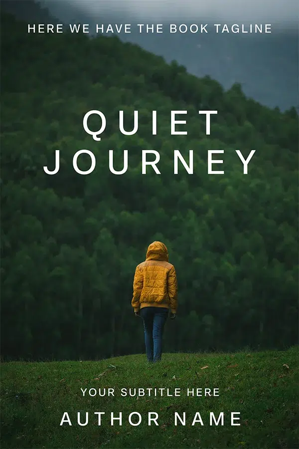
Quiet Journey
Quiet Journey is the move at its cleanest: one small figure in a mustard jacket, a wall of dark green forest, and a widely letterspaced white title floating in the trees. The jacket is the only warm note in the frame, so your eye lands on the person every time. Nothing here says what happened; everything says how it felt.
- The companion. Add a dog, a child, or a partner beside the lone figure and the cover shifts from solitude to relationship without a word of copy.
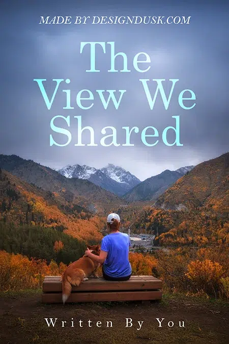
The View We Shared
The View We Shared earns its title visually: a person and a corgi on one bench, both facing snow-dusted peaks over an autumn valley. The pale ice-blue serif title sits in the storm clouds, tying the type to the weather. This is a grief-and-companionship memoir cover before you read a single line.
- The figure dwarfed by scale. Shrink the person to a tenth of the frame and the landscape becomes the antagonist. Survival memoirs and long-journey memoirs live on this ratio.
- The silhouette. A backlit outline carries any age, any body, any era, which is useful when your story spans decades.
- The face you never show. Even in close crops, working memoir covers hide the face: a hat brim, a turned shoulder, deep shadow. Recognition would make it one person’s story; concealment keeps it an open door.
Designs 6 to 10: one object, one life
The object cover compresses a whole life into a single thing. It photographs beautifully at thumbnail size and never ages the way a portrait does.
- The tool of the trade. Whatever your hands did for forty years belongs on the front.
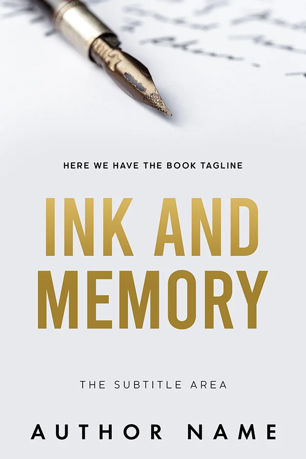
Ink and Memory
Ink and Memory puts a fountain pen nib in razor focus against soft, out-of-focus handwriting, with the title in gold condensed capitals on a white field. It reads as a writer’s life at arm’s length, and the near-empty layout leaves generous room for a subtitle and author name. Restraint is doing all the selling here.
- The desk still life. Group the objects instead of isolating one and you get a portrait of a working life with nobody in it.
Tales from the Writer’s Desk
Tales from the Writer’s Desk draws the whole workspace in one sepia line illustration: typewriter, stacked books, ink bottle, quill. The handwritten script title matches the drawn texture, so type and image feel like one hand made them. Illustrated object covers like this suit gentle, reflective memoirs where a photo would feel too literal.

- The worn thing. The best-known U.S. cover of Cheryl Strayed’s Wild runs on a single scuffed hiking boot against white. The wear is the story: you are looking at an eleven-hundred-mile hike.
- The title made of things. The original U.S. cover of Eat, Pray, Love famously spells its title in pasta, prayer beads, and petals. The trick still works because the objects tell you the itinerary before the subtitle does.
- The object as landscape. The best-known U.S. cover of Educated turns a pencil into a mountain ridge with a tiny figure on it. One image carries both meanings of the title. That double reading is what a great object cover aims for.
Designs 11 to 14: the honest portrait
Portrait covers promise a person will look you in the eye for 300 pages. They work when the photography is honest and the type stays out of the way.
- The black-and-white studio portrait. Stripping colour strips era and fashion, leaving posture and gaze.
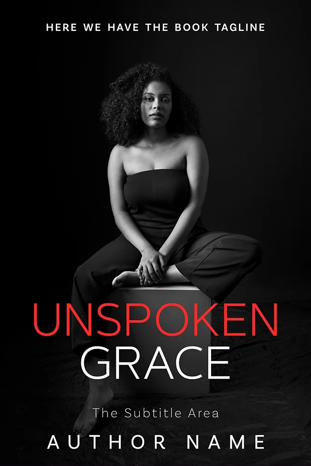
Unspoken Grace
Unspoken Grace holds a direct gaze in monochrome, with one word of the title in thin red capitals and one in white. That single red word against a grey-scale image is the whole colour budget, and it lands like an underline. A portrait this composed says the author has made peace with being seen.
- The split field. Divide the cover into a portrait half and a clean type half, and you get gravity plus legibility at any size.
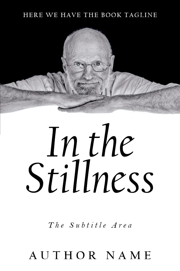
In the Stillness
In the Stillness rests an older man’s chin on his folded arms across the top half, then gives the bottom half entirely to an italic serif on white. The black-to-white split mirrors the title. Late-life memoirs rarely get covers this calm, which is exactly why it stands out on the shelf.
- The archival photograph. A found family photo, grain and damage included, dates the story honestly. Angela’s Ashes set the pattern with a sepia child’s portrait.
- The partial portrait. Hands, a profile, the back of a head: enough person to feel human, not enough to close the door on the reader.
Designs 15 to 18: the past in golden light
Memory has a colour temperature. These four designs use it deliberately.
- The torn edge between then and now. Physically splitting the cover into photograph and paper makes the act of remembering visible.
Echoes of Childhood
Echoes of Childhood runs a sun-flared photo of a child on a swing across the top, then tears the image off mid-cover to reveal white paper and teal condensed capitals below. The ripped edge is the design: the past sits above the tear, the telling below it. Childhood memoirs struggle to avoid sentimentality; the graphic tear keeps this one crisp.

- The nostalgia grade. Push a landscape toward violet and amber and it stops being a place and becomes a memory of one.
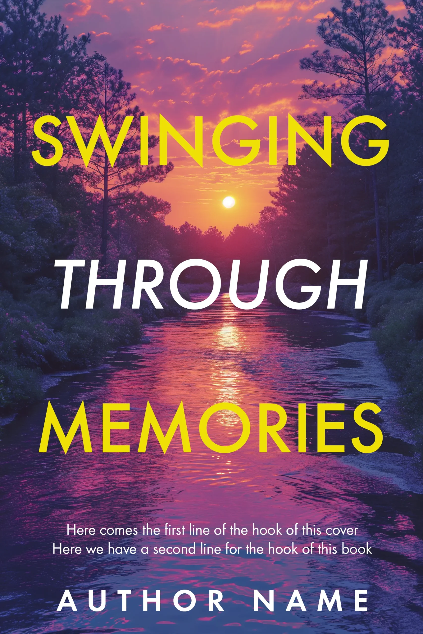
Swinging through Memories
Swinging through Memories grades a river sunset into saturated purple and gold, then stacks the title in alternating yellow and white capitals down the whole frame. The palette does the remembering. This is the loudest cover in this list, and it shows how far you can push colour once the composition stays simple.
- The place that raised you. One street, one farmhouse, one coastline, shot or illustrated plainly. Setting-as-character covers suit memoirs where leaving home is the plot.
- The season as a chapter. Frost, blossom, or fallen leaves stand in for a life stage. Quietly effective for grief and recovery memoirs.
Designs 19 to 22: type carries the voice
Some memoirs are voice-driven enough that the title is the image.
- Script as handwriting. A brush or pen script reads as the author’s own hand, which is the most intimate signature a cover can carry.
- The type-only cover. No image at all: a strong serif, wide margins, one accent colour. It signals literary confidence and is the hardest design here to do well.
- The confession title. When the title itself is a sentence someone would whisper, set it big, centred, and unadorned, and let it do the work.
- Small title, wide margins. Shrinking the type against generous space reads as understatement, and understatement reads as truth.
Designs 23 to 25: absence and aftermath
The bravest memoir covers show what is missing.
- The empty seat. Two chairs facing a view, one bench, one swing with nobody on it. Loss memoirs use absence as the subject, and readers decode it instantly.
- The horizon. A flat line between water and sky, figure optional. It promises reflection rather than event, which suits essay-driven memoirs.
- The threshold. A door ajar, a gate, a path bending out of frame. The unanswered question is the hook: what happened after this?
Matching a design to your memoir
Start with the feeling your book leaves behind, then pick the move above that produces it: figures for journeys, objects for working lives, portraits for reckonings, absence for loss. Our memoir and biography shelf carries 52 in-stock designs across all of these families, each sold once so your cover never appears on someone else’s book. Adventure and journey memoirs should also walk the travel shelf, where the figure-in-landscape family runs deepest. If your story needs a specific object or a specific place that no shelf holds, custom design runs $120 to $350, and our premade versus custom guide explains which route fits which book.
FAQ
One committed decision: a lone figure, a single meaningful object, an honest portrait, or restrained typography. Good memoir covers sell the feeling of the story rather than its events, hold a limited palette, and stay legible at thumbnail size. Covers that try to summarise the whole life fail; covers that compress it into one image work.
Only if the author’s face is part of the promise, as with a public figure or a reckoning-with-being-seen story. Most self-published memoirs do better with a figure seen from behind, an object, or a landscape, because an anonymous figure lets readers place themselves inside the story instead of observing someone else’s.
Muted, weathered palettes dominate: storm greys, forest greens, parchment creams, and golden-hour amber. One warm accent against a cool field, like a yellow jacket in a dark landscape, directs the eye. Loud saturated palettes work only when the composition is very simple, and black-and-white photography remains the most timeless memoir treatment.
A designer-created premade memoir cover costs $49.99 for the ebook file, $99.99 with a print-ready paperback wrap, or $149.99 with hardback, and each design is sold once then retired. Custom memoir cover design, built around your specific photograph, object, or place, runs $120 for ebook, $250 for paperback, and $350 for hardback.