
Quick answer
A self-help cover earns authority with a short title set large, one committed visual idea, and a subtitle that names the outcome in plain words. The genre’s default sunrise gradient is not wrong, just overused. Differentiate with a concept image, confident white space or pure typography, and put credentials under the author name.
Self-help buyers make a trust decision in about two seconds, and they make it from a thumbnail. That is the whole design problem. The cover has to promise a specific change, look like the author can deliver it, and do both at a size smaller than a postage stamp.
We design for this shelf every week, and the same six rules decide whether a cover reads as credible or as another motivational poster. Here they are, each shown on a real cover you can buy.
Our self-help and wellness shelf holds 198 covers as of this update. Every design is sold once, then retired. Designer-created covers run $49.99 ebook / $99.99 with the paperback wrap; AI-assisted covers are labelled as such and start at $24.99.
Rule 1: know why the sunrise cliche exists before you break it
Sunrises, mountain silhouettes, stacked stones, lone figures with open arms. The cliches of this genre are cliches because they convert: they signal calm, progress and hope faster than any words can. A meditation book with a stone stack on the front is telling browsers exactly which shelf it lives on, and there is real value in that.
Stillness in the Sunlight
The classic done properly. Five balanced stones, one warm light source, and a letterspaced brown title that stays out of the photograph’s way. Nothing here is original and nothing needs to be: a mindfulness buyer recognises the genre instantly, and the craft is in the balance, not the concept. Designer-created, $49.99 ebook or $99.99 with the print wrap.

The rule is to choose the cliche deliberately or avoid it deliberately. Use it when your book sits square in the middle of mindfulness or gratitude and you want instant recognition. Avoid it when your book has a sharper claim, because the rest of this article is about what to do instead. More starting points across genres are in our book cover design ideas guide.
Rule 2: commit to one idea
The strongest self-help covers pick a single visual metaphor and give it the whole frame. Two metaphors halve each other. Three make a collage.
Unlocking Potential
One idea, fully committed. The keyhole is shaped like a lightbulb, the light beyond it is the promise, and the small figure gives the browser someone to be. The orange of the second title word is pulled straight from the sky inside the keyhole, which is the kind of quiet decision that makes a cover feel designed rather than assembled.

A useful test when you brief a designer: describe your cover in one sentence. If the sentence needs the word “and” twice, it is two covers fighting for one book.
Rule 3: typography can be the whole design
The most authoritative covers in this genre often have no image at all. Type-led design says the ideas are strong enough to stand unillustrated, which is exactly the claim a serious self-help book wants to make.
Shatter Your Limiting Beliefs
A long title handled with pure typographic discipline. The count sits at the top in black, the working words stack in red capitals, and the small italic connectives give the eye a rhythm down the page. The gold cracks running through the paper are the one image, and they carry the entire thesis: the broken places are where the value is.

Type-led covers live or die on hierarchy, which brings us to the rule most self-published covers get wrong.
Rule 4: the subtitle carries the promise, so give it a hierarchy
Self-help is the one shelf where the subtitle does the heavy lifting. The title is the hook; the subtitle is the offer. The working hierarchy, top to bottom: an optional short tagline, the title set as large as the frame allows, the subtitle at roughly a third of the title size, the author name last.
Two rules inside that hierarchy. Keep the title to a few words so it survives thumbnail scale. And put the specifics in the subtitle: a number, a timeframe or a named outcome beats an abstract virtue every time.
Go Next-Level
The hierarchy at work: a two-word title you can read across a room, then a subtitle that sells the system with a number, a 9-step blueprint with the outcome spelled out. The leaping silhouette repeats the promise visually. This one is from our AI-assisted tier, labelled as such on the product page, which is why it is priced at $24.99 rather than $49.99.

Rule 5: white space reads as confidence
Crowded covers read as anxious. A cover that leaves most of the frame empty is making a status claim: this book does not need to shout. It is the same signal a premium package makes, and self-help buyers respond to it because the genre’s promise is calm and clarity.
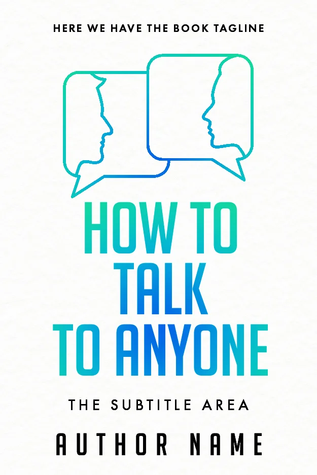
How to Talk to Anyone
Two line-drawn speech bubbles, a gradient title and nothing else. The faces inside the bubbles are drawn with a single continuous line, which keeps the concept light, and the teal-to-blue gradient gives the cover its colour without a photograph anywhere. This is the modern skills-book look: friendly, clean and instantly legible at thumbnail size.
Rule 6: credentials go under the author name, and sometimes nowhere
If you hold a credential your reader cares about, PhD, MD, licensed therapist, it belongs directly after or under your name in small capitals, not in the title. “Dr” earns its place on anxiety, trauma and health books, where buyers actively look for it. On money, habits and confidence books, results language in the subtitle usually outsells letters after a name.
What never works is the credential as the headline. The title sells the change; the credential quietly answers the “says who?” that follows. Business books push this logic further, and the conventions overlap enough that our business cover shelf is worth a browse if your book leans professional.
The workbook exception
Workbooks are their own genre with their own codes: bigger, bolder, more functional. Buyers are often parents, teachers or therapists shopping for someone else, so clarity beats mood.
The DBT Skills Workbook for Teens
Everything about this cover says tool, not memoir. The title fills two thirds of the frame in flat green and black capitals, the therapy modality is named up front, the audience is named on the cover, and the emoji props restate the emotional range the workbook trains. If your book has exercises in it, this is the register to design in.

Buy the shelf version or brief the custom version
A premade from the self-help and wellness shelf costs $49.99 for the ebook cover ($24.99 in the labelled AI-assisted tier) and is retired the moment you buy it, so no other book will wear it. If your concept needs something the shelf does not hold, a specific metaphor, your framework’s name worked into the art, custom design runs $120 to $350. The honest comparison between the two routes is in our premade versus custom guide.
FAQ
Browse the self-help and wellness shelf: 198 covers in stock, each sold once. Designer-created from $49.99, labelled AI-assisted from $24.99.
One committed visual idea, a short title readable at thumbnail size, and a subtitle that names the outcome in concrete terms. Good self-help covers also control their hierarchy: title largest, subtitle at about a third of that size, author name last, credentials in small type where they answer doubt without becoming the headline.
Calm books run on soft blues, greens and warm neutrals; energy and confidence books run on saturated single colours like red, yellow or orange with high-contrast type. The safer rule is one dominant colour plus one accent. Muddy multi-colour palettes are the most common self-published tell on this shelf.
Yes when the credential answers a safety question: mental health, medical, trauma and therapy topics all sell better with a relevant qualification shown. Place it after or under the author name in small capitals. For habit, money and productivity books, a specific promise in the subtitle usually persuades more than letters after a name.
On our shelf, a premade self-help cover is $49.99 for the ebook file, or $24.99 for a labelled AI-assisted design; adding the full print wrap takes those to $99.99 and $59.99. Custom design runs $120 for an ebook cover up to $350 for a hardback. Every premade is sold once and then retired.