
Quick answer
Good poetry cover design is subtraction: one image or texture, generous margins, a title set with room around it, and a palette of two or three colours. The cover promises the collection’s feeling rather than illustrating any single poem. Most weak poetry covers fail by adding; the strong ones hold back.
Most poetry covers fail the same way: too many ideas on one small rectangle. We design poetry covers every week, and the shelf behind this article holds 180+ in-stock designs, so we can show the rules instead of asserting them. This guide covers what to leave out, where the title lives, how much margin a cover needs, and when illustration beats photography. If you want directions organised by mood instead (grief, love, identity, quiet), that lives in our poetry book cover ideas guide. This page is about the craft rules underneath every one of those directions.
Our poetry book covers shelf holds 180+ in-stock designs as of this update, each sold once and then retired. Designer-created covers are $49.99 for the ebook edition ($99.99 with paperback); the shelf’s three AI-assisted covers are labelled as such and priced at $24.99.
Rule 1: One image, and the nerve to stop there
A collection might hold sixty poems. The cover’s job is to promise the feeling of the whole book, and one image does that better than three. Every extra element halves the attention the first one gets. Pick the object, figure or texture that carries the dominant register, then cut everything else and let the field around it do the talking.
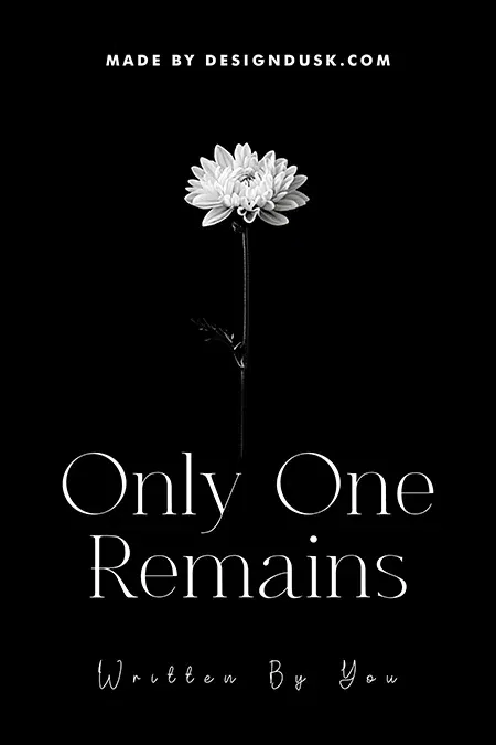
Only One Remains
Only One Remains is the rule at full strength: one flower, one field of black, one thin serif. Nothing competes with the stem, so the eye travels from bloom to title in a straight line. The title even restates the composition. Designer-created, $49.99.
Rule 2: Margins are the design
White space is not the part you have not designed yet. It is the pause between lines, and poetry buyers respond to it because it looks the way the inside of the book reads. Practical version: decide how much of the cover stays empty before you place anything, and defend that decision when the layout starts filling up. Half empty is a reasonable starting point for this genre.
Lines of Flowers
Lines of Flowers pins its botanical line art to the lower left corner and leaves the upper two thirds open. The gold serif sits in clean cream space, an italic subtitle balances the lower right, and the empty diagonal between them works as hard as either element. $49.99.

Rule 3: Give the title its own zone
On a poetry cover the title is usually the biggest single element, so it needs its own territory: top third or bottom third, clear of the image, with consistent alignment. Titles laid across busy imagery need outlines, glows or bars to stay legible, and every one of those fixes adds clutter that this genre punishes.
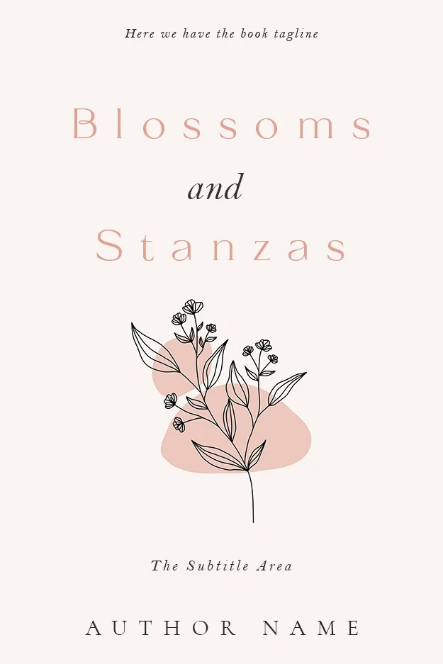
Blossoms and Stanzas
Blossoms and Stanzas stacks its title over three letterspaced lines with a small italic “and”, then floats the line-art sprig below in its own space. Title zone and image zone never touch. The whole palette is two pinks and black, and it needs nothing more. $49.99.
Rule 4: Set type that survives the thumbnail
Poetry books are discovered online, where the cover first appears about 100 pixels wide. Delicate serifs and fine scripts are genre-appropriate, but they must be sized and spaced to survive shrinking. Test every draft at thumbnail scale before you approve it; our book cover size guide has the pixel dimensions that matter per store.
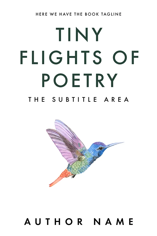
Tiny Flights of Poetry
Tiny Flights of Poetry sets a plain green sans larger than most poetry covers dare, then pays for the boldness with a single watercolour hummingbird and white everywhere else. Shrink it to a search-result thumbnail and the title still reads first. That is the test. $49.99.
Rule 5: Two colours and the paper
Restraint applies to palette hardest of all. The covers above run on cream and gold, blush and black, white and green: one field, one accent, and type in a colour the field already contains. A second accent is occasionally earned. A third almost never is. When a poetry cover feels cheap, the culprit is usually colour count, not image quality.
Rule 6: Know when illustration works
Line art and flat illustration read as handmade and intimate, which suits poetry the way photography often does not. A photograph nails one literal moment; sixty poems rarely share one literal moment. Illustration works when the collection needs warmth or symbolism, and photography earns its place when a single strong image genuinely matches the register, usually landscape, still life or abstract texture rather than a posed figure. Browse the poetry shelf with this split in mind and the two camps separate within a row or two.
Rule 7: Dark covers obey the same rules
White space does not have to be white. It is unoccupied space, and a black field with one small subject follows every rule above.
Lunar Serenity
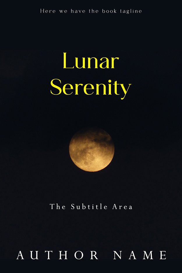
Lunar Serenity is a photograph, but it behaves like a minimalist illustration: a small amber moon in a huge black sky, yellow serif title in its own zone above. The emptiness reads as night and as silence at the same time. $49.99.
Stillness
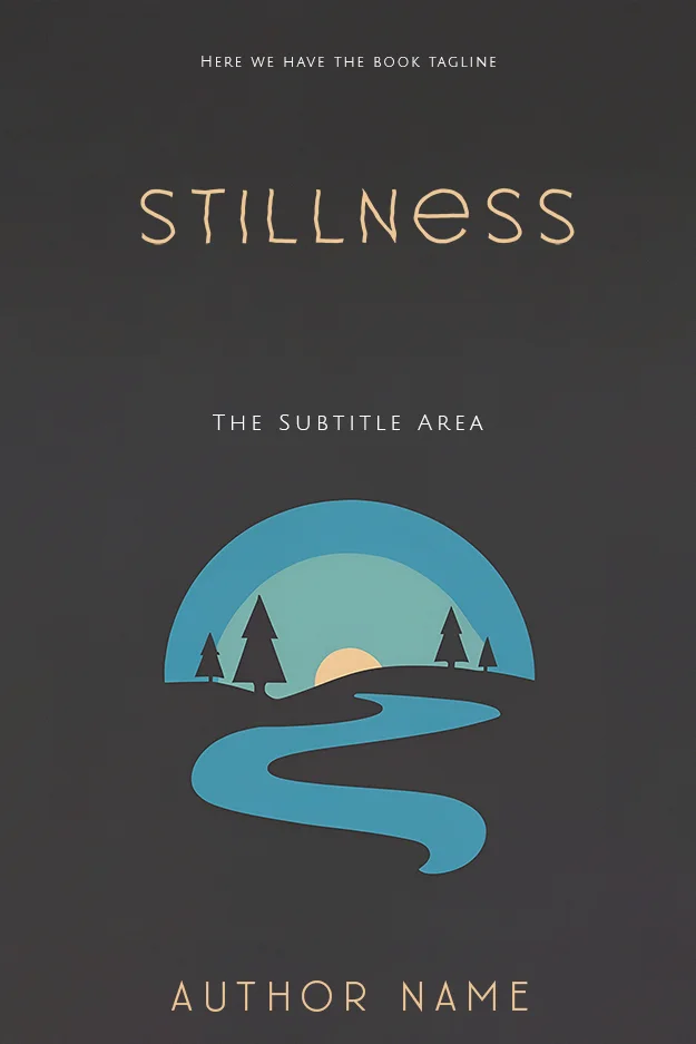
Stillness holds one geometric emblem in the lower half of a dark grey field, with letterspaced cream capitals well clear of it. Margins this generous make a small emblem feel deliberate instead of lost. The palette stays at four muted tones. $49.99.
Chapbooks, collections and the crossover shelves
The rules tighten as the book shrinks. A chapbook has a near-zero spine and often no back-cover real estate worth designing, so the front carries everything and restraint matters even more. At the other edge of the genre, the rules bend toward the neighbouring shelf: love poetry starts borrowing from romance covers (warmer palettes, script type), and devotional verse borrows from religious and spiritual covers (gold on deep blue, light imagery). Borrow the palette by all means, but keep the poetry-shelf discipline about margins and image count.
Buying restraint ready-made
Restraint is cheap to describe and hard to hold onto in your own file at 11 pm. A premade solves that because the discipline is already locked in: every design on our poetry shelf is sold exactly once, then retired, so the cover stays yours alone. Designer-created premades run $49.99 (ebook) or $99.99 with the print wrap; the three AI-assisted designs on the shelf are labelled and cost $24.99. If your collection needs a specific object or a personal photograph handled with the same discipline, custom design runs $120 to $350. Unsure which route fits, our premade versus custom guide walks the decision.
FAQ
One image or texture that matches the collection’s dominant feeling, generous margins, a title with clear space around it, and two or three colours total. The cover should promise the book’s emotional register rather than illustrate a specific poem, and it should still read at thumbnail size.
Almost always, yes. Poetry buyers read white space as a genre signal, the visual version of the pause between lines. Simple does not mean empty: one strong image, a disciplined palette and confident type is a complete design. Crowded covers are the most common failure on this shelf.
No. Type-only poetry covers are a long-standing tradition and still work, provided the typography itself becomes the design: strong letterforms, deliberate spacing, one or two colours. If you are not confident setting type at that level, a single restrained image is the safer route.
Big enough to read at about 100 pixels wide, which is how it first appears in online stores. That usually means larger or more widely spaced than feels natural at full size. Test a shrunk version before approving anything, especially with thin serifs or script faces.