
Quick answer
Effective cookbook covers make one clear promise. They show the food, cooking style, cuisine, personality or result the reader can expect; make the title readable at thumbnail size; and use colour and typography that match the kind of recipes inside. A cover can be photo-led, illustrated, minimalist or type-led, but it should never make readers guess what sort of cookbook they are looking at.
For self-published authors, there are three practical routes: design it yourself with a cookbook cover template, buy an exclusive premade cookbook cover from $24.99, or commission a custom cookbook cover design built around your recipes, photographs and publishing plans.
Cookbooks are among the most visual books on any shelf. A thriller cover sells tension. A memoir cover sells a person or a journey. A cookbook cover has to make a more immediate promise: this is what cooking from this book will feel like.
This guide explains what makes a cookbook cover work, gives practical cookbook cover ideas for different niches, shows real examples from the DesignDusk collection, and covers the publishing details that are easy to overlook until the final file is due.
What Makes a Cookbook Cover Work?
1Decide what the cover is selling
Before choosing a photograph, font or colour palette, decide what the reader is really buying.
Most cookbook covers lead with one of four things:
- The food: a finished dish, ingredient arrangement or close-up that creates immediate appetite appeal.
- The author: useful when the chef, creator or personality is already part of the book’s value.
- The lifestyle: the kitchen, family table, garden, region or slower way of living around the recipes.
- The method or result: fast meals, high-protein eating, baking basics, budget cooking or another practical benefit.
The strongest covers choose a clear priority. A cover becomes weaker when the food, author portrait, kitchen scene, badges and long subtitle all fight for attention.
2Make the title carry the recipe promise
A cookbook title is not only a name. It tells the reader what they will be able to cook or achieve.
Compare a vague title such as Good Food with a more specific promise such as 30-Minute Mediterranean Dinners. The second title immediately communicates cuisine, speed and use. The cover design should strengthen that promise rather than bury it.
For practical cookbooks, the subtitle can do much of the selling:
- 100 high-protein recipes for busy families
- Simple sourdough recipes for first-time bakers
- One-pan dinners with fewer than ten ingredients
- Traditional recipes from a specific region or family
Give that information enough space. A beautiful food photograph cannot rescue a subtitle that is unreadable on a phone.
3Design for thumbnail size first
On Amazon, social media and most online bookstores, the cover is initially seen as a small thumbnail. That means the hierarchy has to survive before anyone enlarges the image.
A practical test is to reduce the front cover until it is roughly the height of a product thumbnail. Check three things:
- Can you read the main title immediately?
- Can you understand the main image without studying it?
- Can you tell what kind of cookbook it is?
If the answer to any of these is no, the design is not finished. Small decorative text, crowded ingredient collages and low-contrast lettering are usually the first elements to fail.
4Use colour as a category signal
Readers interpret colour before they consciously analyse the cover.
Warm terracotta, cream, olive and sunlit wood can suggest Mediterranean or rustic cooking. Bright greens, clean whites and fresh natural colour often suit health, salad and meal-prep books. Dark browns, amber light and textured surfaces can support comfort food, barbecue or traditional recipes. Rich reds, pinks and chocolate tones work naturally for desserts and baking.
These are not rigid rules. The point is consistency. The palette should support the promise of the title and the mood of the recipes.
5Treat typography as part of the cuisine
Typography can make the same photograph feel rustic, premium, playful, scientific or modern.
A loose hand-lettered title may suit home baking or family recipes. A refined serif can make a regional or chef-led cookbook feel established. A bold sans-serif works well for fitness, meal preparation and quick-result books. Decorative fonts should be used with restraint, especially when the title is long.
A useful rule is to let one type style carry the personality and use a quieter typeface for the subtitle and author name. Four competing fonts rarely make a cookbook look more creative; they usually make it look less professional.
10 Cookbook Cover Ideas for Different Types of Books
The best cookbook cover ideas begin with the book’s actual audience. A vegan meal-prep guide should not look like a heritage baking collection, even when both include beautiful food photography.
1Use one hero dish
A single, carefully selected dish is the clearest cookbook cover idea for most general recipe collections. It creates appetite appeal and gives the layout one obvious focal point.
Choose a dish that represents the whole book rather than simply the most attractive photograph. A seafood plate may look impressive, but it will mislead readers when only three recipes in the book contain seafood.
Leave uncluttered space for the title. The best image is not necessarily the busiest one; it is the one that still works after the typography is added.
Best for: general cookbooks, regional cuisine, restaurant recipes and signature-dish collections.
2Build the cover around ingredients
An ingredient-led cover can communicate freshness, seasonality and variety without committing to one finished recipe. Herbs, spices, oils, vegetables or baking ingredients can create a strong visual system when arranged deliberately.
This works especially well when the book is about a cuisine, ingredient or method rather than one style of plated meal. Avoid the scattered stock-photo collage. The arrangement should feel composed, not downloaded.
Best for: Mediterranean cooking, pantry guides, seasonal recipes, plant-based cooking and single-ingredient books.
3Sell the atmosphere of cooking
Not every cookbook cover needs a close-up plate. A rustic table, outdoor meal, family kitchen or quiet baking scene can sell the lifestyle surrounding the recipes.
Atmosphere-led cookbook covers are useful when the book includes personal stories, traditions or a strong sense of place. The reader is buying participation in that world, not only a list of meals.
Best for: food memoirs, family recipe books, farmhouse cooking, slow living and regional traditions.
4Make the author the trust signal
An author portrait works when the cook, chef, nutritionist or creator already has an audience—or when their personality is central to the book.
The portrait should still connect to food. A natural kitchen setting, active cooking moment or table scene usually communicates more than a formal headshot placed beside a dish.
For an unknown first-time author, a large portrait is not automatically persuasive. In that case, the recipes or result may deserve more visual space than the author name.
Best for: chef-led books, influencer cookbooks, expert nutrition guides and personality-driven brands.
5Use illustration instead of photography
Illustrated cookbook cover design can feel more distinctive than another food photograph, particularly in crowded categories. It can also unify many recipe types without forcing one dish to represent the whole collection.
Illustration works best when it has a clear concept: a stylised pan, repeated ingredients, vintage packaging, a regional motif or a playful cooking scene. Generic clip art arranged around a title will not create the same effect.
Best for: baking, cocktails, gift books, children’s cookbooks, vintage-inspired recipes and creative culinary guides.
6Let the title become the main image
Type-led cookbook covers are useful when the method or promise matters more than the food styling. A bold title such as Five Ingredients, Power Protein or Dinner in 20 can act as the main visual element, supported by a simple ingredient or colour system.
This approach needs excellent hierarchy. When photography is reduced, weak typography becomes impossible to hide.
Best for: diet books, meal-prep guides, quick recipes, challenge-based cookbooks and practical how-to titles.
7Keep healthy cooking clean, not clinical
Healthy cookbook covers often use white space, fresh ingredients and bright natural colour. The risk is making the book look medical, generic or joyless.
Food should still look satisfying. Show texture, variety and abundance rather than a lonely salad leaf. Pair clean typography with a clear benefit such as protein, energy, balance or time saved.
Best for: wellness, high-protein, low-carb, plant-based, fitness and meal-prep books.
8Let baking and dessert covers indulge
Dessert and baking covers can support richer colour, closer crops and more decorative typography than many savoury cookbooks. Texture matters: icing, crumbs, chocolate, flour and steam can make the food feel tangible.
Do not overload the cover with five different desserts merely to show variety. One memorable cake or pastry often creates a stronger invitation.
Best for: cakes, bread, pastries, chocolate, holiday baking and dessert collections.
9Use one recognisable regional cue
For a regional cookbook, one strong cue is often more effective than a collection of stereotypes. A colour palette, ingredient, serving style, landscape texture or traditional pattern can establish place without turning the cover into a travel brochure.
The title and subtitle should name the region clearly. The visual then adds flavour and authenticity instead of carrying the entire explanation.
Best for: Italian, Mediterranean, Caribbean, South Asian, Middle Eastern and local heritage cookbooks.
10Make a family recipe book feel personal
A family recipe book does not have to compete like a commercial Amazon release, but thoughtful design still makes it more meaningful. A handwritten recipe, old kitchen photograph, family table, heirloom utensil or restrained pattern can create genuine emotional value.
When the book will also be sold publicly, balance that personal material with a clear subtitle so strangers understand why the collection matters.
Best for: keepsake books, community collections, church or school fundraisers and multigenerational recipes.
Real Cookbook Covers from the DesignDusk Collection
The following examples show how different cookbook cover ideas work in practice. Each is an exclusive premade from our cookbook and recipe cover collection. The title, subtitle and author name are personalised after purchase, and each design is sold once before being retired.
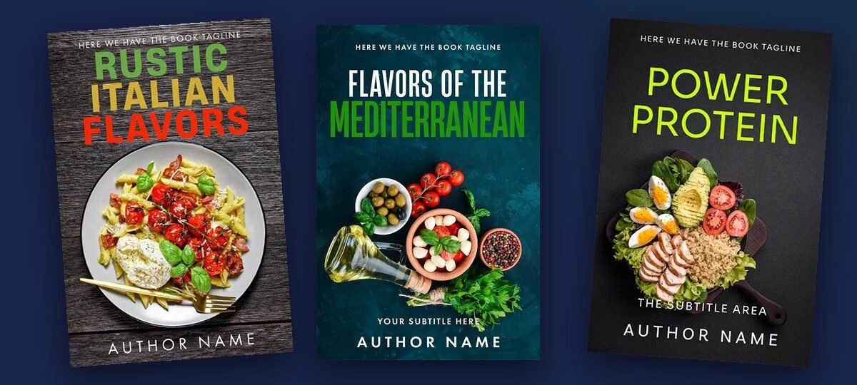
Rustic Italian Flavors
Why it works: the finished dish creates immediate appetite appeal, while the warm setting supports the promise of comforting Italian cooking. It is a strong example of choosing one hero dish rather than showing every recipe category at once.
Best fit: Italian recipes, pasta collections, rustic cooking and comfort food.
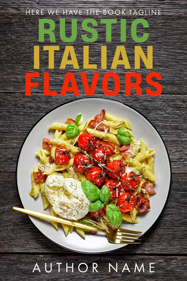
Rustic Kitchen Essentials
Why it works: the ingredient-led composition suggests variety and freshness without tying the book to one plate. The darker background creates contrast and gives the cover a more premium, pantry-inspired mood.
Best fit: kitchen fundamentals, pantry cooking, Mediterranean ingredients and rustic recipe collections.
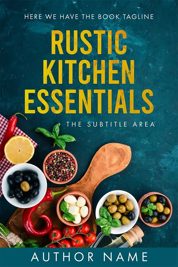
Fresh Flavors Fusion
Why it works: the bright ingredients communicate freshness and balance at a glance. The overhead bowl format also gives health-focused titles and benefit-led subtitles a clear visual context.
Best fit: healthy meals, high-protein recipes, grain bowls, meal preparation and fusion cooking.
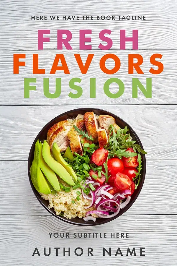
Flavors of the Mediterranean
Why it works: recognisable ingredients establish the cuisine quickly, while the rich background stops the cover from feeling like a generic health-food layout. The image sells both flavour and place.
Best fit: Mediterranean recipes, olive-oil cooking, regional cuisine and ingredient-led guides.

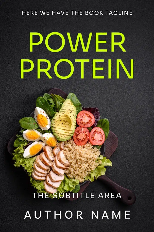
Power Protein
Why it works: the title promise and food imagery support each other immediately. Readers do not have to infer whether the book is about gourmet entertaining or practical nutrition—the result is clear at thumbnail size.
Best fit: fitness recipes, high-protein eating, meal preparation and healthy lifestyle guides.
The Art of Cooking
Why it works: this is an example of illustrated cookbook cover design rather than conventional food photography. The simple central symbol and high contrast make it suitable for a broader culinary guide or skills-based book.
Best fit: cooking techniques, culinary fundamentals, chef training and modern illustrated cookbooks.

Because DesignDusk covers are sold once, availability changes. Browse the current premade cookbook covers to see which designs are still in stock.
Cookbook Cover Design Mistakes to Avoid
Showing too many dishes
A collage of six or eight meals may feel like good value, but at thumbnail size it often becomes visual noise. Choose one focal image or a controlled ingredient arrangement.
Using a generic title without a clear subtitle
A title such as Fresh Food leaves too much unanswered. A useful subtitle can explain the cuisine, number of recipes, intended reader or practical benefit.
Choosing style over category fit
A minimalist abstract cover may look beautiful in isolation but fail to signal food, baking or recipes. Distinctive is useful only when the right reader still recognises the category.
Making the food look dull or artificial
Poor lighting, unrealistic colour and heavy editing can reduce appetite appeal. The cover image should feel intentional and believable, whether it is photography, licensed stock, compositing or AI-assisted imagery finished by a designer.
Forgetting the print wrap
The ebook front cover is only one part of a printed cookbook. A paperback or hardcover also needs a spine, back cover, bleed, safe areas and barcode space. Final dimensions depend on the trim size, page count, paper and publishing platform.
Designing before the title is final
Cookbook titles and subtitles are often long. Changing them late can break a layout that was built around shorter placeholder text. Finalise the wording—or at least its likely length—before approving the composition.
DIY, Premade or Custom: Which Route Should You Choose?
| Route | Typical cost | Turnaround | Best for | Main limitation |
|---|---|---|---|---|
| DIY or cookbook cover template | $0–$50 | Your own time | Private family projects, test editions and very tight budgets | Easy to look generic; licensing and print setup remain your responsibility |
| Premade cookbook cover | $24.99–$49.99 ebook; .99–.99 with paperback files at DesignDusk | Usually within 24 hours after details are confirmed | First cookbooks, clear cuisine fit, smaller budgets and close launch dates | The main artwork already exists, so major image changes are not included |
| Custom cookbook cover design | From $120 for ebook at DesignDusk | Usually one to a few weeks | Original photography, series branding, unusual concepts and specific art direction | Higher cost and a longer decision process |
A premade is the practical choice when an existing design already communicates your cuisine and audience. Custom makes more sense when your own food photography is central, the author must appear on the cover, the book combines unusual niches, or you are building a recognisable series.
Our premade vs custom book cover guide compares the two routes in more detail. You can also read about what a premade book cover is before buying from any marketplace.
What to Give Your Cookbook Cover Designer
A good brief saves time and helps the designer make decisions that match the book rather than simply making attractive food art.
Include:
- The final or near-final title, subtitle and author name
- The type of recipes and the main cuisine or method
- The intended reader
- Three to five competing cookbooks your audience already recognises
- Your preferred mood, such as rustic, premium, playful, clean or traditional
- Your own photography, including the original high-resolution files
- Any ingredients, symbols or visual clichés to avoid
- Planned formats: ebook, paperback, hardcover or audiobook
- Print platform, trim size and final page count when available
- Whether the book is part of a future series
Do not brief a designer with only “make it pop.” Explain what the cover must communicate and who needs to notice it.
Cookbook Cover Sizes and Print Details
For Kindle ebooks, a 1,600 × 2,560-pixel front cover is the standard DesignDusk starting point. Print covers do not have one universal size. The complete wrap changes with the book’s trim size, binding, page count, paper type and platform.
Cookbooks often use larger formats such as 8 × 10 or 8.5 × 11 inches because recipes, photographs and tables need room. A larger trim size changes the front and back dimensions, while the final page count determines the spine width.
Before the print cover is completed:
- Finalise the interior file and page count.
- Choose the trim size, paper and binding.
- Confirm whether you are publishing through KDP, IngramSpark or both.
- Generate a separate template for each platform and format.
- Decide whether the platform will generate the barcode or whether you will supply one.
Our book cover size guide explains the current KDP and IngramSpark requirements, spine calculations, bleed and safe areas. For barcode decisions, see the ISBN guide for self-publishers.
A Practical Cookbook Cover Checklist
Before approving the final design, check the cover at full size and thumbnail size.
- The cuisine, method or result is clear within a second.
- The title remains readable on a phone.
- The subtitle communicates a useful promise.
- The main image accurately represents the recipes.
- The colour palette fits the subject and mood.
- The typography feels intentional and uses a clear hierarchy.
- The author name has the right level of prominence for the author’s existing audience.
- The cover does not rely on a crowded food collage.
- All photography, fonts and design assets have appropriate commercial licensing.
- The print wrap uses the exact template for the chosen platform.
- The barcode zone and safe areas are clear.
- The cover still works beside competing books in the same category.
The last check matters. A cookbook cover should not be judged only against a blank Photoshop canvas. Place it beside real books your intended reader already buys. It should fit the shelf quickly enough to be understood and differ enough to be remembered.
Choosing the Right Cookbook Cover
There is no single visual formula for all cookbook covers. A close-cropped dish can be perfect for one book and completely wrong for another. The right decision comes from the book’s promise.
Start with three questions:
- What will the reader be able to cook or achieve?
- Which image or visual idea communicates that fastest?
- Will the title and promise survive at thumbnail size?
Answer those clearly and the remaining decisions—colour, typography, photography and layout—become easier.
Ready to choose a design? Browse our current cookbook covers and recipe book covers. Every premade is labelled by creation method, personalised with your title and author name, sold once, and retired after purchase. For a cover built around your recipes or original food photography, explore custom book cover design.
Frequently Asked Questions
A cookbook front cover normally needs the title, author name and a clear visual signal of the cuisine, cooking method or result. A subtitle is especially useful when it explains the number of recipes, intended reader, diet, region or time-saving benefit.
A good cookbook cover accurately represents the recipes, creates appetite or lifestyle appeal, uses readable typography and remains understandable at thumbnail size. It should look appropriate beside other books in the same category without appearing like a copy of them.
Simple cookbook cover ideas include one hero dish with restrained typography, an overhead ingredient arrangement, a single illustrated cooking symbol, or a bold type-led cover with one supporting food element. Simplicity works when the title and image make one clear promise together.
Yes. Original food photography can make a custom cookbook cover more personal and specific. Supply the highest-resolution original file and allow room for cropping and typography. On a premade cover, replacing the main image usually changes the design enough to require custom work.
Show food when the recipes are the main selling point. Use the author prominently when the chef, creator or expert already has recognition or when their personality is central to the book. Some covers combine both, but one should remain visually dominant.
A DIY template can cost little or nothing, although the author still handles layout, licensing and print setup. At DesignDusk, premade ebook covers currently start at $24.99 for AI + Human designs and $49.99 for designer-created designs. Custom ebook cover design starts at $120. Prices should be checked before ordering because packages can change.
No. Each DesignDusk premade cover is sold once and then retired from the store. The title, subtitle and author name are personalised for the buyer before the final files are delivered.
The ebook option includes the front-cover file. The ebook and paperback option also includes a full print wrap prepared around the final trim size, page count and publishing platform. Hardcover and audiobook formats may require separate files or add-ons.
For an ebook, DesignDusk commonly prepares a 1,600 × 2,560-pixel front cover. A paperback or hardcover does not have one fixed size because the full wrap depends on trim size, page count, paper, binding and platform. Generate the exact print template only after the interior is final.
A premade cover can usually be personalised and delivered within 24 hours once the title and author details are confirmed. A custom cover normally takes longer because it includes briefing, concept development and revisions.