
Quick answer
The strongest poetry book covers start from the feeling of the collection, not from imagery that simply looks poetic. Name the emotional register first, whether that is grief, love, identity, quiet, protest or faith, and the visual language follows: grief takes one symbolic object and darkness, quiet needs negative space, protest can carry hard contrast and collage.
A poetry cover has a harder job than most. There is no plot to promise and often no genre shelf to sit on, so the design has to communicate a feeling before the reader opens a single page. That is why organising ideas by mood works better than organising them by style.
Below are 30 poetry book cover ideas grouped into six emotional registers. The examples are real covers from our poetry book covers shelf, each one available to a single author and retired permanently after purchase. Every cover shown here is $49.99 for the ebook edition, so these are designs you could actually use, not gallery pieces to admire.
Availability note: every cover shown is in stock at the time of this update. Each design is sold once and then retired, so if a cover has gone, the idea behind it still stands and the poetry shelf will have related directions.
Quick guide: choose a poetry cover style by mood
Use this table to shortlist a direction, then read the section below it for composition, imagery and typography detail.
| If your collection feels like | Strong visual direction | Colour approach | Type direction |
|---|---|---|---|
| Grief and loss | One symbolic object, absence, darkness | Black, bone, muted gold, grey | Quiet serif or restrained script |
| Love and longing | Almost-touch, portrait, letters, skin and shadow | Red, blush, burgundy, dark neutrals | Serif, script, expressive display type |
| Identity and selfhood | Collage, fragmentation, mirrors, handwriting | Primaries, ochre, black and white | Modern sans, bold condensed type |
| Quiet and nature | Negative space, botanicals, horizon, small objects | Cream, blue, sage, soft earth tones | Delicate serif, light sans, handwritten accent |
| Protest and witness | Torn paper, redaction, crowds, stencil | Red, black, white, hot accent colours | Heavy sans, stencil, compressed display type |
| Faith and spirit | Light, paths, celestial symbols, open hands | Gold, deep blue, black, dawn tones | Elegant serif, restrained capitals |
Grief and loss poetry book cover ideas
Grief is the register that punishes decoration hardest. One object, a dark or muted field, and typography that stays quiet will say more than a crowded scene.
1. Flowers where they should not be
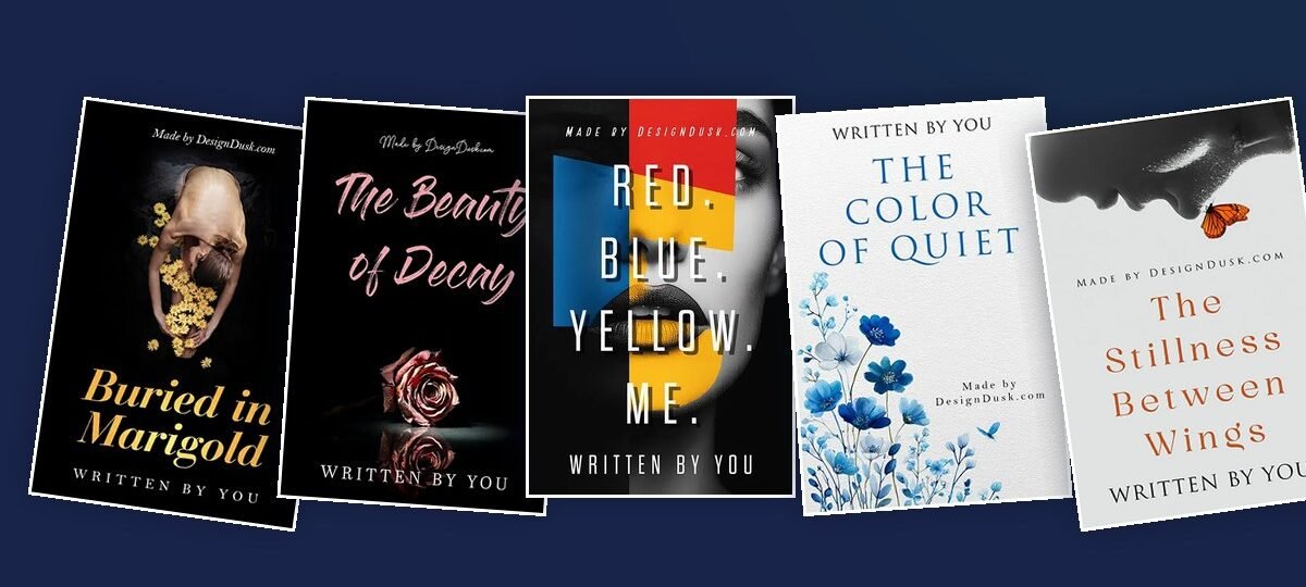
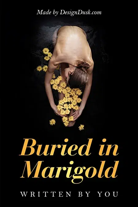
Buried in Marigold places a bowed figure in darkness with yellow marigolds spilling from her arms and a gold italic title beneath. The flowers do the mourning, which leaves the figure free to be still. Strong for collections about loss that carry warmth as well as sorrow.
2. The half-dead bloom
Where Beauty Withers photographs a gerbera daisy that is half in flower and half withered against near-black. It tells a before-and-after story inside a single object, which suits collections written across a long illness or a slow ending.

3. The emptied place. An unmade bed, a single chair, a coat still hanging on a hook. Rather than showing grief directly, show the space someone has left behind and let the reader supply the person.
4. Water at night. A dark sea, river or lake with one distant point of light makes the frame feel vast and specific at the same time. It works particularly well for poems about memory, distance and isolation.
5. The spotlit relic
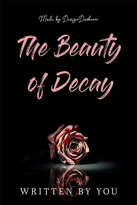
The Beauty of Decay lights a single wilted rose against black, with its reflection below and a soft pink script above. One object that belonged to someone, lit like evidence, carries more history than a full scene can.
Design rule: grief covers rarely need several visual ideas competing at once. One image with emotional weight is enough. Browse the darker end of the poetry shelf to see the register in bulk.
Love and longing poetry book cover ideas
Love poetry does not have to look conventionally romantic. Distance, restraint and incompleteness communicate longing better than a literal couple.
6. The almost-touch. Two hands, two silhouettes or two faces separated by a small gap. The gap is the poem, so protect it and resist the urge to close the distance.
7. Painted heat
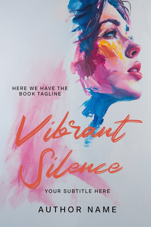
Vibrant Silence renders a face in loose, saturated brushstrokes, with blue hair, coral skin and an expressive script title. The colour reads as emotion before the viewer processes the portrait, which suits collections that run hot rather than wistful.
8. Pressed flowers and letters. Old paper, handwritten notes, envelopes and pressed botanicals suit collections about memory, old love and relationships preserved through objects.
9. Skin and shadow. A shoulder, a collarbone, a profile or a hand photographed in hard light suggests intimacy without becoming explicit. The restraint is what creates the longing.
10. The single red element. One red petal, thread, mark or piece of fabric against black. The eye goes straight to the emotional pressure point and stays there.
Design rule: decide whether the collection is about closeness or absence. Covers about absence get stronger when the figures never touch. More directions sit on the poetry shelf.
Identity and selfhood poetry book cover ideas
Collections about identity can carry more visual disruption. Collage, fragmentation, interrupted portraits, handwriting and strong typography all make sense when the subject itself is changing or being reconstructed.
11. The colour-block self
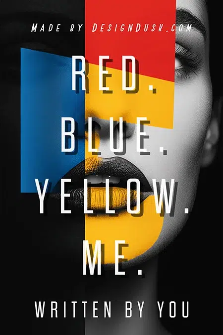
Red. Blue. Yellow. Me. interrupts a black and white face with Mondrian-style panels of red, blue and yellow while tall capitals stack around the portrait. It feels contemporary without needing a complicated scene, which is why this direction suits debut collections.
12. The fractured portrait
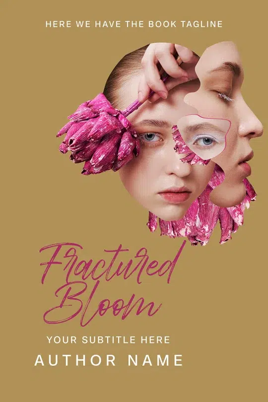
Fractured Bloom layers cut-out faces and pink petals on ochre. The seams between the pieces are not hidden, they are the point, so the cover admits the collection is about being put back together imperfectly.
13. The mirror that does not match. Show a reflection that differs from the person looking into it: another age, another expression, another landscape entirely.
14. Handwriting as the artwork. Use the poet’s own handwriting, crossed-out phrases, marginal notes or a single handwritten sentence as the dominant visual language.
15. The double exposure. Fill a profile or silhouette with a landscape, a city or flowers. The technique is familiar, so the interior image has to have a real connection to the poems rather than acting as decoration.
Design rule: if the poetry is about fragmentation, the cover can be fragmented too. If the collection arrives at a stable self, a more ordered composition tells that story better.
Quiet, mindfulness and nature poetry book cover ideas
Quiet covers depend on space. The blank area is not unfinished design, it is part of the emotional register, and this is the direction poets buy most often from our own shelf.
16. The butterfly landing
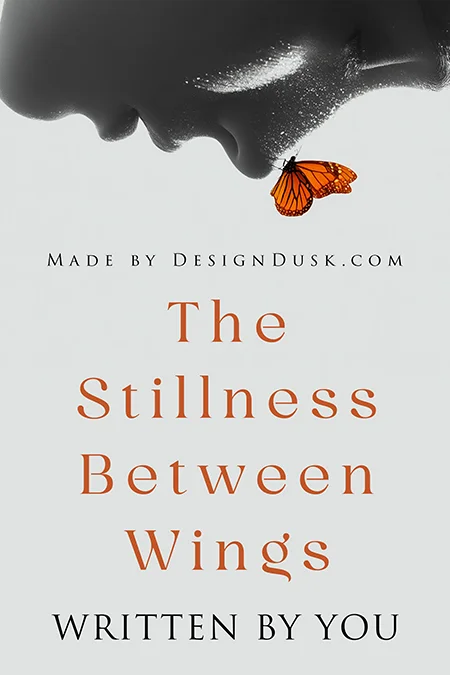
The Stillness Between Wings places an inverted grayscale profile at the top of the frame, a single monarch butterfly at the lips, and a pale field below where the title breathes in letterspaced serif type. The empty lower half is doing as much work as the image.
17. Watercolour botanicals
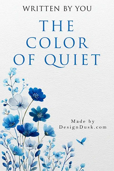
The Color of Quiet grows blue wildflowers up one side of a textured white page. The uneven painted edge adds hand-made warmth without filling the composition, which keeps the cover calm rather than decorative.
18. The body in the meadow
Stillness in the Meadow photographs bare legs in daisy-filled grass from above, with a handwritten script running across the image. It feels tactile and personal rather than grand, which suits collections rooted in small moments.

19. Horizon minimalism. Place the sea, a field or a distant treeline low in the frame, then leave most of the cover to sky and typography.
20. One natural object on paper. A single leaf, feather, shell or stone centred on a lightly textured surface. The classic that never dates, provided the object means something to the poems.
Design rule: when the poetry is quiet, resist the urge to fill every empty area. Negative space creates the pause the poems are asking for.
Protest and witness poetry book cover ideas
Protest and witness poetry tolerates visual friction and usually benefits from it. The design can look interrupted, cut apart, stamped over or redacted.
21. Torn-paper collage. Combine fragments of headlines, photographs, documents and handwritten notes, then let the torn edges stay visible. The construction itself suggests competing narratives.
22. Stencil and spray. Treat the title like a public message rather than polished book typography. Stencil lettering and uneven paint create urgency when the poems have a street-level voice.
23. The raised hand or fist. One strong silhouette against a flat colour field, with everything else kept disciplined so the symbol stays powerful instead of turning into poster clutter.
24. Redacted text. Cover lines of text with heavy black bars and let only selected words survive. This suits collections about censorship, silence, institutions and testimony.
25. The crowd as texture. A dense field of small figures reads as pattern from a distance and resolves into individuals up close, which is useful when the poems move between personal and collective experience.
Design rule: hard contrast, compressed sans type and stencil forms fit this register. The delicate serifs that suit the quiet shelf would defuse it.
Faith and spiritual poetry book cover ideas
Spiritual poetry does not need literal religious imagery. Light, thresholds, scale and celestial forms can carry faith, doubt or searching without over-specifying the belief.
26. Light through darkness. A shaft of light entering a dark interior, or dawn through trees. The contrast suggests hope without illustrating any particular poem.
27. Gold on deep blue or black. The oldest sacred palette there is. Use it sparingly, because one gold symbol or a restrained title reads as more considered than a cover covered in metallic effects.
28. Open hands. Cropped close against a plain background. Depending on pose and lighting, the same image can suggest prayer, surrender, receiving or release.
29. The path or doorway. A road disappearing into mist, a gate, a staircase or a partly open door onto light, representing movement without defining the destination.
30. Celestial minimalism. A thin gold circle, a single star, a moon or an eclipse, letting the symbol carry the cover instead of a full scene.
Design rule: match the level of symbolism to the collection. Devotional work supports recognisable imagery, while collections about doubt usually work better with light, distance and abstraction.
How to choose the right poetry book cover
If several directions fit your collection, run them through this five-step filter before you commit.
1Name the dominant emotional register
Do not design around the one poem you love most. Ask what the majority of the collection feels like. One angry poem should not turn a quiet book into a protest poster.
2Choose one visual metaphor
Decide what carries the emotion: a person, an object, a landscape, a texture or a typographic idea. Start with one, and add a second element only if it makes the first one clearer.
3Build the colour language around the mood
Colour should reinforce the emotional promise rather than simply decorate. Marigold warms grief, red pressurises longing, primaries sharpen identity work, gold suggests ceremony.
4Test the cover at thumbnail size
Poetry is mostly discovered online, where the cover first appears around 100 pixels wide. If the title disappears or the focal point turns to noise at that size, simplify the design.
5Compare it with the books beside it
Study poetry covers in the same emotional territory. The aim is to feel recognisably relevant to that reader without becoming interchangeable with everything around you.
Common poetry book cover mistakes
- Trying to represent every poem. A cover is a promise about the collection, not an illustrated table of contents.
- Using poetic imagery with no connection to the work. Moons, feathers and silhouettes only work when they belong to the emotional language of the poems.
- Making delicate type too small. Elegant typography still has to survive an online thumbnail.
- Using too many visual metaphors. One meaningful object is stronger than five symbolic objects fighting each other.
- Choosing style before emotion. Minimalist and dark are treatments. Start with what the reader should feel.
- Forgetting the author name. Poetry titles are often short and dominant, but the name still needs contrast and space.
When a premade poetry cover works, and when custom makes more sense
Premade
A premade works when a finished design already matches the emotional register and tone of your collection. The main visual decision is solved, and at DesignDusk each design is sold once and then retired, so it stays yours alone. Poetry premades run $24.99 for our labelled AI-assisted designs and $49.99 for fully designer-created covers, with print wraps available on every design.
Custom
Custom makes more sense when the cover depends on a specific symbol, a personal object, your own photograph or a concept that cannot be substituted without changing the meaning of the collection. Custom book cover design runs from $120 to $350 depending on which print formats you need.
If you want to start from finished directions, browse the current poetry book cover collection. If your collection needs something built around one specific idea, start with a custom brief instead.
Poetry book cover FAQ
At minimum a poetry book cover needs the title, the author name and one clear visual direction. Restraint usually wins: one meaningful image or texture, enough negative space, and typography that supports the mood instead of competing with it.
Name the dominant emotional register of the collection, such as grief, love, identity, quiet, protest or faith. Shortlist two or three visual directions from that register, then test each one at thumbnail size and choose the design that still communicates clearly when reduced.
For ebooks, 2560 x 1600 pixels is the standard. Print covers depend on your trim size, page count and paper, because those determine the full wrap and spine width, so build the print file on your printer’s template.
Premade poetry covers at DesignDusk are $24.99 for labelled AI-assisted designs and $49.99 for designer-created designs, each sold once and then retired. Custom poetry covers run from $120 to $350 depending on the formats required.