
Quick answer
Horror covers signal fear through subgenre codes, not gore. Gothic wants decay and elegant serifs, folk horror wants daylight and silhouettes, slashers want the killer’s face, cosmic horror wants the inhuman, psychological horror wants the almost-normal. Match the code and readers know the flavour of fear before they read a word.
Horror readers shop by subgenre, and each subgenre has a visual dialect. A folk horror cover on a slasher novel does not look edgy; it looks mis-shelved, and the wrong readers open the sample. We design horror covers weekly, so this guide names the working codes for seven subgenres, each shown on a real in-stock cover from our horror shelf.
Our horror book covers shelf holds 161 in-stock designs as of this update. Every cover is sold once, then retired. Designer-created covers are $49.99 ebook / $99.99 with paperback; labelled AI-assisted designs start at $24.99.
1. Gothic horror: decay, veils and elegant type
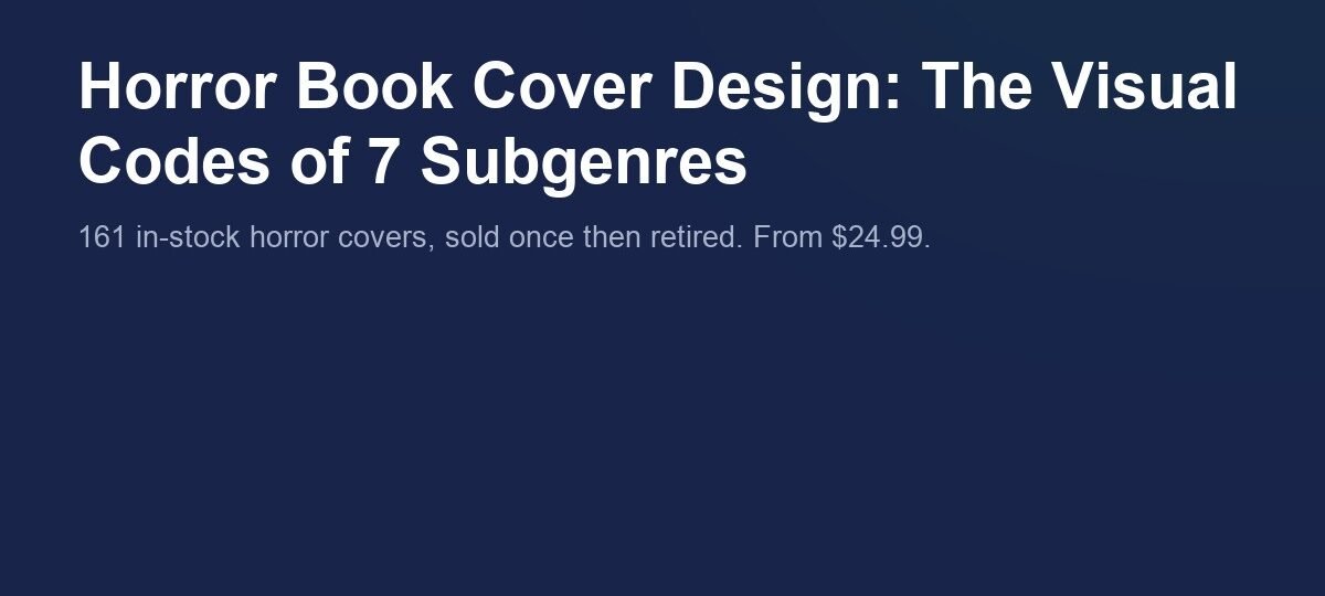
Gothic covers mourn. The palette is stone, ash and bone with one romantic accent, and the type is a refined serif rather than anything scratched. The dread comes from grief and old places: ruins, veils, reflections, a single flower where a body should be. If your gothic reads more romance than horror, the paranormal romance shelf shows where that line sits; the horror side of it lives on our horror shelf.
The Mourning Rose
The Mourning Rose runs the full gothic code: a faceless veiled figure, rubble and rock in muted browns and greys, a mirrored reflection in still water, and a thin white serif title. The lone red rose at the foot of the cover is the only saturated colour in the frame, which is exactly why it reads as loss rather than decoration. Designer-created, $49.99 ebook tier.
2. Folk horror: the land itself is wrong
Folk horror inverts the usual rule that darkness is scary. Its covers lean on pale mist, open woodland and daylight, with the threat shown as a shape that belongs to the land: horns, antlers, wicker, standing stones. Hand-drawn or brush-lettered type signals the rural and the ritual. Browse the forest-and-field end of the horror shelf and you can pick the folk titles out at a glance.
Horns Of The Forest
Horns Of The Forest puts the creature in fog-white daylight between dark tree trunks, so the horned silhouette reads instantly at any size. The cracked yellow-to-orange brush lettering does the ritual work: it feels painted by hand, not set by a machine. Designer-created, $49.99 ebook tier.

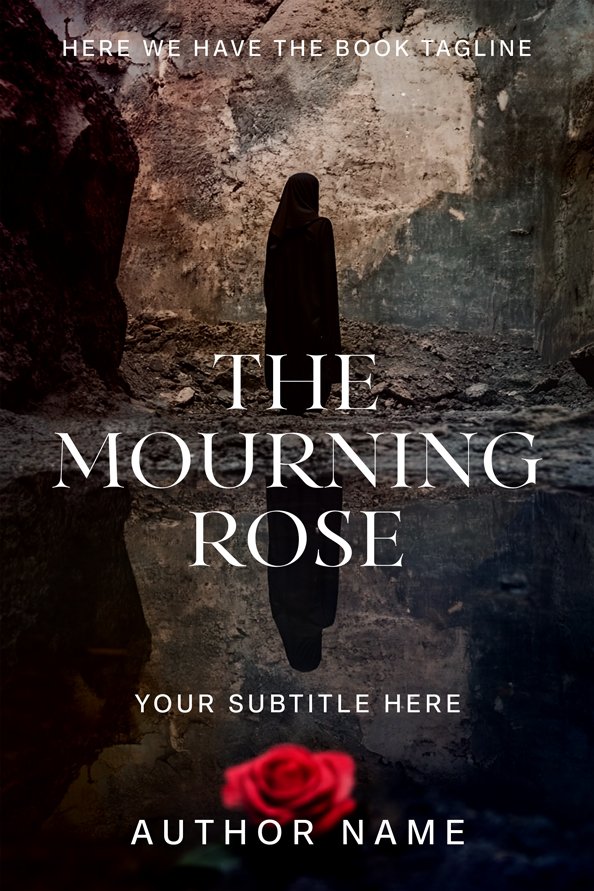
3. Cosmic horror: the inhuman up close
Cosmic and sea horror covers trade on wrongness rather than threat. Cold palettes, blue-grey light, and bodies that are almost human but not quite: too many scales, black eyes, geometry that should not hold. Type is usually stark and distressed, because ornament would soften the wrongness. The deep-sea and occult end of our horror covers runs on exactly this register.
Ocean Enigma
Ocean Enigma is the code in one face: fully black eyes, fish scale texture creeping over human skin, and a cold blue rim light that makes the portrait feel refrigerated. The distressed stencil capitals sit flat and industrial against all that biology. The face is beautiful first and wrong second, which is the exact order cosmic horror wants. Designer-created, $49.99 ebook tier.
4. Slasher: show the killer
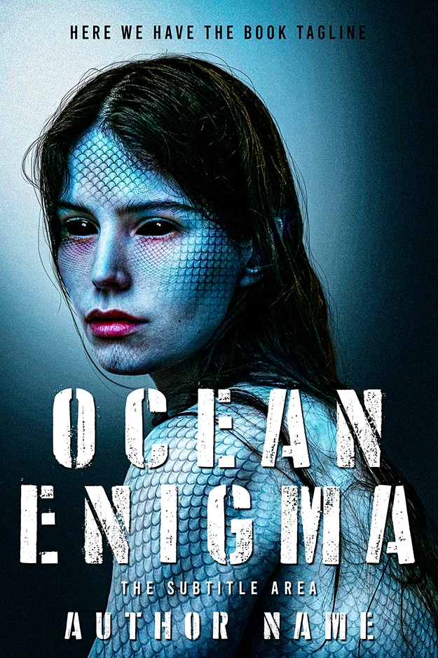
Slasher covers are the bluntest dialect in horror: the killer or the mask, a weapon, and red used as light rather than accent. Where gothic implies, slasher confronts. Scratched stencil capitals and heavy grunge type are standard because the genre promises violence with a body count. One craft rule still applies: imply the act, never depict it. KDP’s current content guidelines apply to cover art and say Amazon will not sell material it deems inappropriate or offensive. The slasher row of the horror shelf shows how much menace fits inside that limit.
Red Glow of Terror
Red Glow of Terror bathes the whole frame in a single red source, so the grinning clown and the wrapped bat feel photographed at the scene rather than composed. The scratched white stencil title is the genre’s handwriting. Nothing violent is shown, and the cover still promises exactly one kind of book. Designer-created, $49.99 ebook tier.
5. Psychological horror: the almost-normal
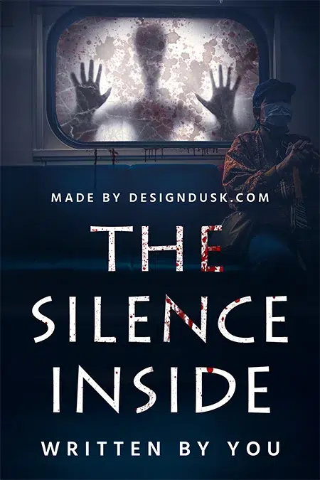
Psychological horror covers stay one step inside reality. Ordinary places, muted colour, clean type, and one detail that breaks the scene: a handprint on glass, a watcher who should not be there. The restraint is the signal. Readers who want this subgenre are fluent in thriller covers too, so the split between our mystery and thriller shelf and the quiet end of the horror shelf is worth studying before you commit.
The Silence Inside
The Silence Inside is built on one wrong thing: a figure pressed against the fogged window of an ordinary commuter train, hands flat on the glass, while a masked passenger ignores it. The palette stays cold and civic, and the thin white capitals stay calm. The horror is that the scene is 95 percent normal. Designer-created, $49.99 ebook tier.
6. Extreme horror: the unflinching close-up
Extreme horror signals intensity with proximity. Faces fill the frame, blood is present but arrested, and type is either brutal or pointedly elegant to create dissonance. This is the code that walks closest to the retailer line, so the working rule is: aftermath, not act. Blood that has already run reads extreme; an injury in progress gets a cover rejected. The hard end of the horror shelf stays on the printable side of that line.
Bleeding Faith
Bleeding Faith fills the frame with a face and lets dried blood tracks do the talking. The dissonance is the design: a delicate white serif and a small silver cross set against the damage. It promises transgression with zero depicted violence, which is the entire craft of extreme covers that stay live on Amazon. Designer-created, $49.99 ebook tier.

7. Paranormal and haunted house: the building is the monster
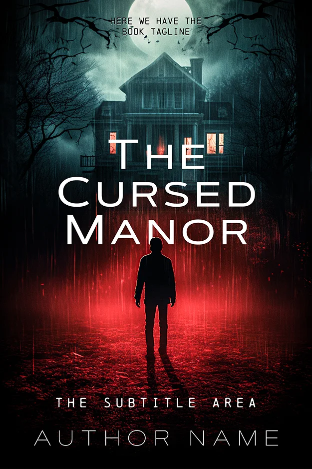
Haunted house covers give the architecture a face. The house sits high in the frame, windows lit like eyes, weather doing the emotional work, and a small human figure supplying scale. Serif type with a supernatural glow or texture is the norm. It is the most-searched horror flavour on our horror covers shelf, and the one where a $24.99 cover can look like a $2,000 one.
The Cursed Manor
The Cursed Manor stacks every haunted house signal: full moon, bare trees, lit windows in a dark facade, and a lone boy on the path with red light pooling around him like a warning. The white serif title floats calmly over the chaos. AI-assisted, labelled, $24.99 ebook tier.
Picking your subgenre code on purpose
The fastest way to test your own cover is the shelf test: place it in a grid of its neighbours and ask which row it joins. Our horror shelf is that grid, 161 covers deep, and every design above is sold exactly once. If your book crosses subgenres or needs a specific scene, custom design runs $120 to $350 and we build to the code you choose. Deciding between the two paths is its own question; our premade vs custom guide walks the maths, and our book cover design ideas article covers concept work before genre.
FAQ
Anticipation, not gore. Effective horror covers show the moment before harm: a silhouette in daylight, a figure at a window, a mask in red light. The scare is supplied by the reader. Subgenre matters more than shock value, because readers scan for the visual code of the exact flavour of fear they want.
Black is the base almost everywhere, with red as the standard accent. Beyond that, palettes split by subgenre: gothic runs stone grey and bone, folk horror runs pale mist and daylight greens, cosmic horror runs cold blue-grey, slashers run red-on-black, and psychological horror keeps muted, realistic colour with one wrong detail.
Match the subgenre, not a generic “horror font”. Gothic and haunted house covers use elegant serifs, folk horror uses hand-drawn or brush lettering, slashers and extreme horror use scratched or stencilled capitals, and psychological horror uses clean, quiet sans-serifs. Dripping novelty fonts read as Halloween party invitations and cost the cover its credibility.
No. Figures create fast emotional reads, and 161 covers on our horror shelf show every option: full figures, silhouettes, masked faces and empty places. Object and architecture covers (a house, a rose, a mask) often age better and read cleaner at thumbnail size. What matters is one clear focal point carrying the subgenre code.