

Quick answer
Every working nonfiction cover answers three questions. Promise: what will this book change for me? Proof: why should I believe it? Person: who is telling me this? The title and image carry the promise, the subtitle and credentials carry the proof, and the author treatment carries the person.
Fiction covers sell a feeling. Nonfiction covers sell a result, and that difference explains almost every design decision on the shelf. We keep 536 nonfiction covers in stock across five categories as of this update, and when we audit our own designs, the ones that sell answer the same three questions: promise, proof, person.
This is the framework. Genre by genre the answers change costume, but the questions never do.
The covers below come from our nonfiction shelves, 536 in stock across self-help, business, biography and memoir, religious and other non-fiction. Every design is sold once, then retired. Designer-created: $49.99 ebook / $99.99 with the paperback wrap. Labelled AI-assisted tier: from $24.99.
The promise: what changes for the reader?
The promise is the reason the book exists, and it should be readable in under two seconds: title plus image, no fine print. Metaphor is the usual vehicle because outcomes like “better leadership” have no literal photograph.
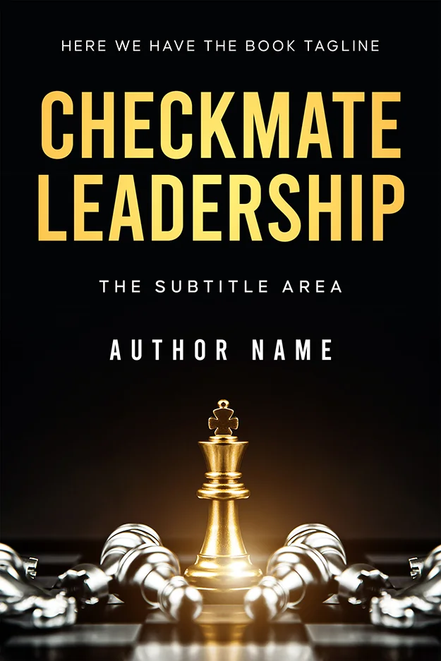
Checkmate Leadership
The promise stated as an endgame: one gold king upright, every silver piece down. You will be the one standing. Black field, gold type, dramatic underlighting, all borrowed from luxury packaging because the promise here is status as much as skill. Designer-created, $49.99 ebook or $99.99 with the print wrap.
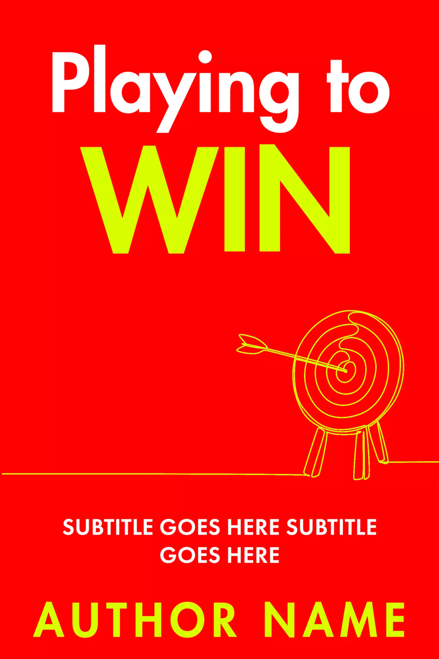
Playing To Win
The same question answered at the opposite volume: a flat red field and a one-line doodle of an arrow in a bullseye. The promise is precision, so the drawing is a single unbroken line. This design is from our AI-assisted tier, labelled as such on the product page, which is why it costs $24.99 instead of $49.99. The label is the honest version of a question every cover buyer should be asking anyway.
The proof: why should anyone believe it?
Proof lives in the layer of type most authors treat as an afterthought: the subtitle, the credential line, the specifics. A nonfiction subtitle earns its place by being concrete. Numbers, timeframes, named methods and named audiences all read as evidence; abstract virtues read as decoration.
Proof can also be visual. A technical book proves competence by looking competent about its subject.
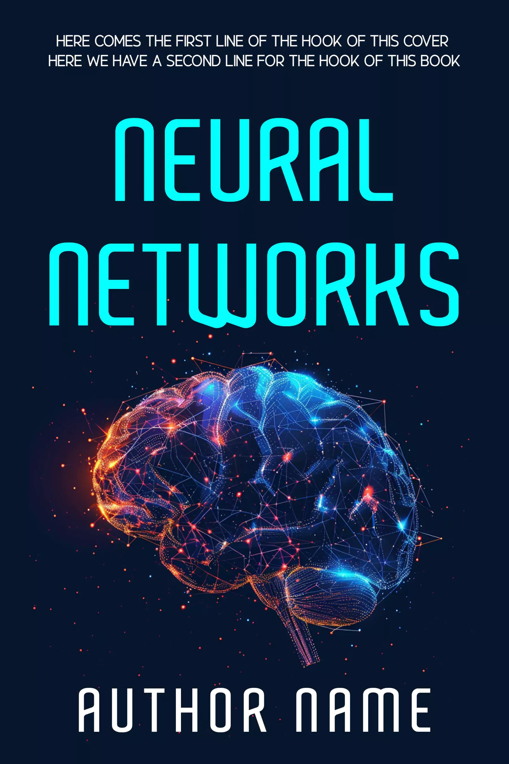
Neural Networks
Subject-matter fluency as proof. The wireframe brain is built from exactly the node-and-edge imagery the field uses to describe itself, and the squared-off cyan type matches. A reader cannot check the contents from a thumbnail, so they check whether the cover speaks the discipline’s visual language. This one does, and that is the argument.
The credential question has a simple rule: show the qualification when the topic carries risk (health, mind, money, faith), place it small and near the author name, and let the subtitle do the persuading everywhere else.
The person: who is talking to me?
Nonfiction buyers want to know who is behind the advice, and the cover answers with the author treatment: how large the name sits, whether a face appears, how the reader is addressed.
How to Raise Joyful Kids
Here the person on the cover is the reader, not the author. A real family sits inside a line-drawn house: the photograph supplies warmth and the drawing supplies the idea of home as something you build. Parenting buyers are shopping for their own family, so the cover shows them the after version of it.

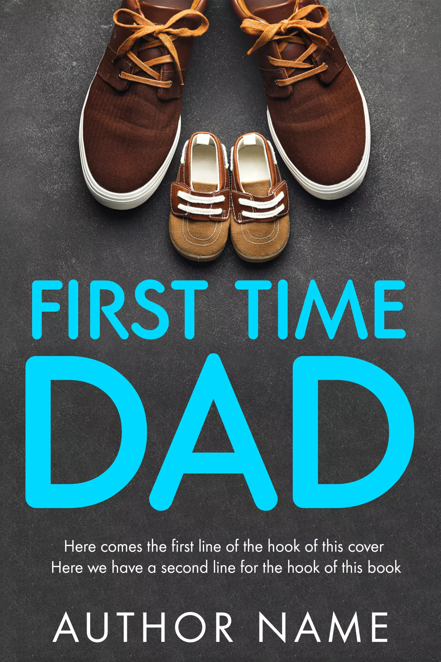
First Time Dad Book Cover
The person implied by two pairs of shoes. Big sneakers, tiny matching ones, and the whole identity shift of new fatherhood is on the cover without a single face. Object covers like this are the practical answer when you have no portrait worth printing, which is most self-publishers. The friendly rounded type keeps it reassuring rather than sentimental.
One boundary worth naming: when the person IS the book, a biography or autobiography, the cover rules change enough to need their own article, and portraits bring rights questions with them. If you are writing your own story rather than someone else’s, our memoir cover guide covers that lane; for lives of other people, browse the biography and memoir shelf.
The framework in one table
| Cover element | Question it answers | Common mistake |
|---|---|---|
| Title + main image | Promise: what changes for me? | Two metaphors fighting for one frame |
| Subtitle | Proof: why believe it? | Abstract virtues instead of numbers, methods, audiences |
| Credential line | Proof: says who? | Credentials as headline instead of quiet support |
| Author treatment | Person: who is talking? | Unknown author set huge, or a weak portrait used from duty |
| Colour + type register | All three at once | Borrowing another genre’s codes and mis-shelving the book |
How the answers change by genre
The questions stay fixed; the costume changes. Self-help answers the promise with a change of state and proves it in the subtitle, on soft palettes or flat colour fields (self-help shelf, 192 covers). Business answers with outcome metaphors, dark fields and metallics, and proves it with results language (business shelf, 119 covers). Religious and devotional books lead with the person addressed and prove through scripture and restraint (religious shelf). How-to and everything-else nonfiction leans hardest on the literal promise, often naming the audience right on the cover (other non-fiction shelf, 118 covers).
We will link the genre-specific guides from here as they publish; this page is the spine.
Using the framework when you buy
Run the three questions over any cover you are about to buy or approve. If you cannot state the promise in one sentence, the cover is decoration. If nothing on it functions as proof, the subtitle is wasted. If you cannot tell who is talking, the author treatment needs another pass.
Every premade on our shelves has already been through that audit: $49.99 designer-created or $24.99 labelled AI-assisted, sold once and retired. If your promise needs an image no shelf holds, custom design runs $120 to $350, and the honest comparison between routes is in the premade versus custom guide.
FAQ
Start with the shelf that matches your book: self-help, business or other non-fiction. 536 nonfiction covers in stock, each sold once, from $24.99.
Five things: a short title carrying the promise, one committed image that restates it, a subtitle with concrete proof (a number, method or named audience), the author name, and a credential line when the topic involves health, money or the mind. Anything beyond those five usually weakens the cover.
Hierarchy and restraint. One visual idea, a title readable at thumbnail size, a subtitle clearly subordinate to it, and a palette of one dominant colour plus one accent. Professional covers also match their genre’s visual register, so a business book looks like business and a wellness book looks like wellness.
Almost always. The subtitle is where nonfiction carries its proof: the specific outcome, the method, the timeframe or the audience. A rare exception is the established-author book whose title is already a complete promise. For a first book, skipping the subtitle throws away the cover’s most persuasive line.
Fiction sells an experience, so its covers trade in mood, character and scene. Nonfiction sells a result, so its covers work like an argument: promise in the title and image, proof in the subtitle and credentials, person in the author treatment. That is why strong nonfiction covers often look closer to good packaging than to art.