
Quick answer
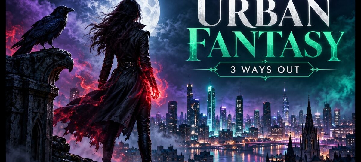
Urban fantasy covers converge on one formula: a night city, a lone figure in leather, visible magic or a weapon, cool blue-purple grading. They look the same because sameness is how readers find the genre. To stand out, keep the code and pull one of three levers: composition, colour discipline, or symbol.
Line up twenty urban fantasy bestsellers and you will see one cover twenty times: a skyline after dark, one person facing away or glaring back, a glowing hand or a drawn blade, everything graded blue and purple. Authors ask us how to avoid the cliche. The honest answer is that you mostly should not, and this article is about the difference between the part of the formula that is load-bearing and the part you can bend. Our live fantasy book cover design guide maps all eight fantasy subgenre codes in one place; this page goes deep on just this one.
Covers shown are from our fantasy shelf, 245 designs in stock as of this update. Every design sells once, then retires. Designer-created covers are $49.99 ebook / $99.99 with paperback wrap; labelled AI-assisted covers are $24.99 / $59.99.
The formula, spelled out
The urban fantasy code has four fixed parts. The city says the magic lives in our world, not a secondary one. The night says the magic is hidden from daylight people. The lone figure says one person stands between the two worlds. The visible power (lit hands, runes, a blade) says the protagonist acts rather than witnesses. Cool grading binds the four together into a single genre-recognisable object.
Every part answers a reader question at thumbnail size, which is why the formula survived a decade of designers trying to be original.
Why the sameness converts
Genre readers do not browse the way designers wish they did. They scan a search page of thumbnails in seconds, looking for the shape of their next book, and the formula IS that shape. A cover that abandons it does not read as fresh; it reads as a different genre, and the click goes elsewhere. The same mechanism holds across category fiction, and it is why we advise authors to break rules inside the code, never instead of it.
So the real question is not how to look different. It is which single element you can own while the rest of the cover keeps saying urban fantasy. Three levers do this reliably.
Lever 1: composition. Merge the city with the creature
The laziest version of the formula stacks its parts: figure in front, skyline behind. The first lever is structural: fuse two parts of the code into one image, and the cover becomes a puzzle the eye wants to resolve.
Beastly Skylines
Beastly Skylines runs a double exposure: a walking bear whose body is filled with a city skyline, icy blue at the edges, warm sepia in the towers. City and beast, the genre’s two poles, occupy the same pixels. It reads clean at thumbnail because the outer silhouette stays simple, and it stands out on a search page precisely because no figure is glaring at the camera. Designer-created, $49.99.
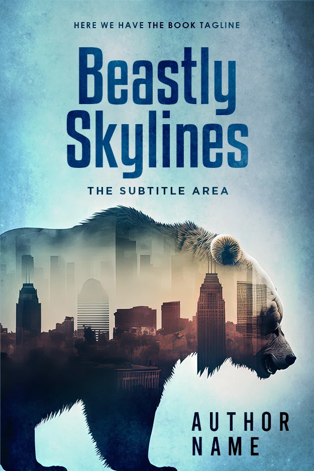
Shifter fiction takes this lever most naturally, but it works for any book where the city itself is half alive.
Lever 2: colour. Own one colour completely
The genre default is blue-purple everything. The second lever keeps the night, the figure and the power, then commits to a single colour so completely that the cover becomes findable by hue alone.
The Power Below
The Power Below dresses its heroine in red leather, puts crackling red energy in both fists, and frames her in dark industrial girders lit by the same red. One colour, saturated and repeated, against near-black. In a row of blue-purple thumbnails this cover is the one your eye snags on, yet every element is textbook urban fantasy: night structure, lone woman, visible power, attitude. Designer-created, $49.99.
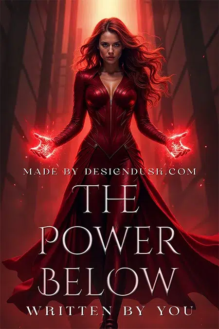
If you pull this lever across a series (book one red, book two green, book three gold), you get shelf presence and instant series branding from the same decision.
Lever 3: symbol. Let an omen stand in for the heroine
The third lever removes the figure entirely and promotes one of the genre’s omens: the familiar, the sigil, the blood moon. This trades a little findability for a lot of intrigue, so the rest of the cover must stay strictly in code.
Whispers In The Fog
Whispers In The Fog fills the frame with a black raven perched in a grey, graffiti-toned alley, neon-pink runes glowing along its wing. The bird is doing the protagonist’s job: it watches you. The pink sigils supply the visible-magic beat the formula demands, in a palette nobody else on the shelf is using. Designer-created, $49.99.

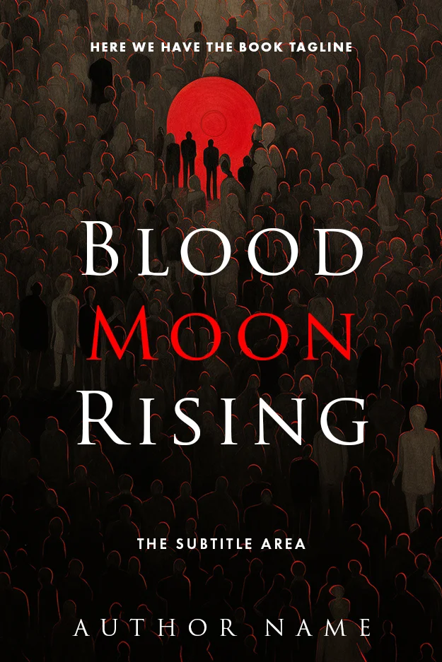
Blood Moon Rising
Blood Moon Rising works the same lever with a crowd: dozens of faceless dark figures under an enormous red moon, two silhouettes picked out against it. The hidden-world premise of urban fantasy, drawn literally. White and red serif lines keep the title readable across the busy field. Designer-created, $49.99.
The border you should not cross by accident
The formula has neighbours, and grading alone moves you between them. Same night palette, same lone cloaked figure, but swap the skyline for a castle and the cover now promises gothic or portal fantasy.
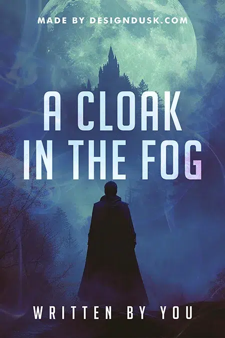
A Cloak in the Fog
A Cloak in the Fog is the demonstration: cloaked figure, fog, moonlight, all the urban fantasy mood, but the silhouette inside the moon is a castle in a forest, so the promise is old-world mystery rather than city magic. Neither cover is wrong; they are different contracts. Check which one your blurb signs. Designer-created, $49.99.
The other porous border is paranormal romance, where the couple replaces the lone figure and the palette warms. If your book leads with the relationship, shop the paranormal romance shelf instead; mis-shelving costs more sales than any cover decision.
An honest note on our shelf
True city-skyline urban fantasy runs only a few covers deep in our 245-cover fantasy stock at any given time; the designs above are the current in-stock picks, and each sells once. If they are gone, or your book needs a specific city, creature or artefact, this is the subgenre where we most often recommend custom design ($120 ebook, $250 paperback, $350 hardback): the formula is strict enough that a brief nails it reliably. The trade-offs between waiting for the right premade and commissioning are laid out in our premade versus custom guide.
FAQ
Browse the current urban fantasy picks on our fantasy shelf, 245 covers in stock, each sold once. From $24.99.
Four signals working together: a modern city environment, night-time or low light, a lone capable figure, and visible supernatural power such as glowing hands, runes or an unsheathed weapon, usually under cool blue-purple grading. Remove too many of these and readers will file the book as thriller, gothic or paranormal romance instead.
Blue and purple night tones dominate the genre, with a single accent colour for the magic: red, green, or neon pink. Black anchors the composition. Warm, bright palettes signal other genres. The strongest covers commit to one accent and repeat it in the clothing, the light and the type.
Usually yes; the lone figure is the genre’s strongest signal, and readers expect it. But it is not mandatory. A familiar, a sigil or a blood moon can stand in for the protagonist if the rest of the cover keeps the code, and that swap is one of the most effective ways to stand out.
Keep the formula and change exactly one thing. Merge two of its elements into one image, like a creature silhouette filled with skyline; commit the whole cover to one owned colour instead of default blue-purple; or replace the heroine with an omen. Breaking the formula outright makes the book invisible to its own readers.