
Quick answer
Series cover branding comes from four levers: a locked title type treatment, a repeated layout grid, a controlled palette, and one consistent art treatment. Lock at least three and flex one, usually the palette, and three different books read as one shelf at thumbnail size.
A reader shopping for book two does not read your blurb again. They scan a screen of thumbnails for the shape and colour they already know, and either find it in half a second or drift. That recognition is the entire job of series branding, and it comes down to four controllable design decisions. We build matched sets every week, so this guide names the levers, shows real pairs from our shelves, and is honest about where ready-made designs stop and custom takes over.
Every cover shown below is in stock as of this update and sells once, like all 1,610 designs we list. The sets shown are Designer-Created: $49.99 ebook, $99.99 with the paperback wrap, $149.99 with hardback.
Why do series covers need to match?
Because series sell backwards. A browser who meets book three cold needs to see, instantly, that two books came before it and that they all belong to the same world. On a retailer results page your cover renders smaller than a postage stamp, and at that size a reader processes only the silhouette, the dominant colour block and the shape of the title type.
A matched set turns every later book into an advertisement for the first one, and it removes the most expensive moment of doubt: the returning reader hovering over book two, unsure it is really yours. Browse our fantasy shelf and the families jump out before you read a single title.
What are the four levers of series consistency?
Every matched series holds its shelf together with the same four levers, and the craft is choosing which to lock and which to flex before book one ships.
| Lever | What locking it means | How far it can flex |
|---|---|---|
| Type lock | Same title typeface, same case and spacing, same position logic | The colour of the type can shift per book; the typeface never does |
| Layout grid | Title zone, author zone and focal point sit in the same places | The focal subject changes; where it sits does not |
| Palette | One shared palette, or one dominant hue rotated per book | Full rotation works if the other three levers hold |
| Art treatment | Same medium, render style and finish on every cover | Subject matter changes freely; the style does not |
Lever 1: the type lock
The strongest lever. Readers recognise a title treatment before they consciously read a word of it. Lock the typeface, the case, the letterspacing, the position, and the treatment of the author name. If book one used a chunky rounded display face and book two arrives in an elegant serif, it reads as a different author. The practical step: get the exact font names in writing from your designer while book one is being built.
Lever 2: the layout grid
The grid is where things live: title zone at the top or in the lower third, author line anchored at the bottom, focal subject in the same spot every time. A locked grid is what lets wildly different art still scan as siblings, because the reader’s eye lands in the same places on every book. It is also the cheapest lever to document: a screenshot of book one with three guides drawn on it is a usable spec.
Lever 3: the palette rotation
Palette is the lever most series flex on purpose. Two systems work. Hold one palette across every book for a uniform shelf, which suits crime and literary series. Or rotate one dominant hue per book while everything else stays locked, the colourway system, which dominates in romance and lighter fantasy because each entry feels like a new flavour of the same product.
Charming Drake
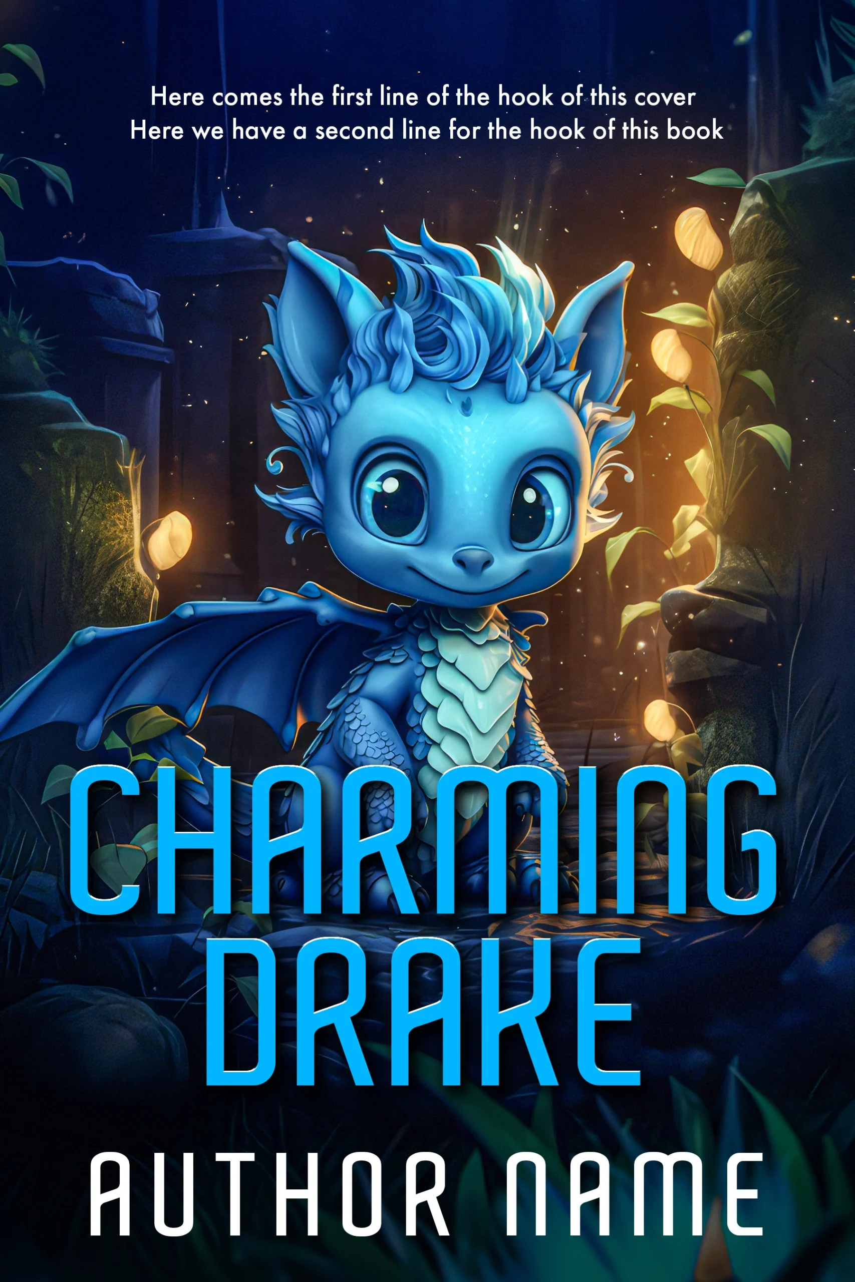
Book-one energy from our fantasy shelf: a wide-eyed blue baby dragon sits in a moonlit forest strung with glowing amber lights, and the title runs in a bright blue rounded display face across the lower third. Designer-Created, $49.99 at the ebook tier.
Charming Drake
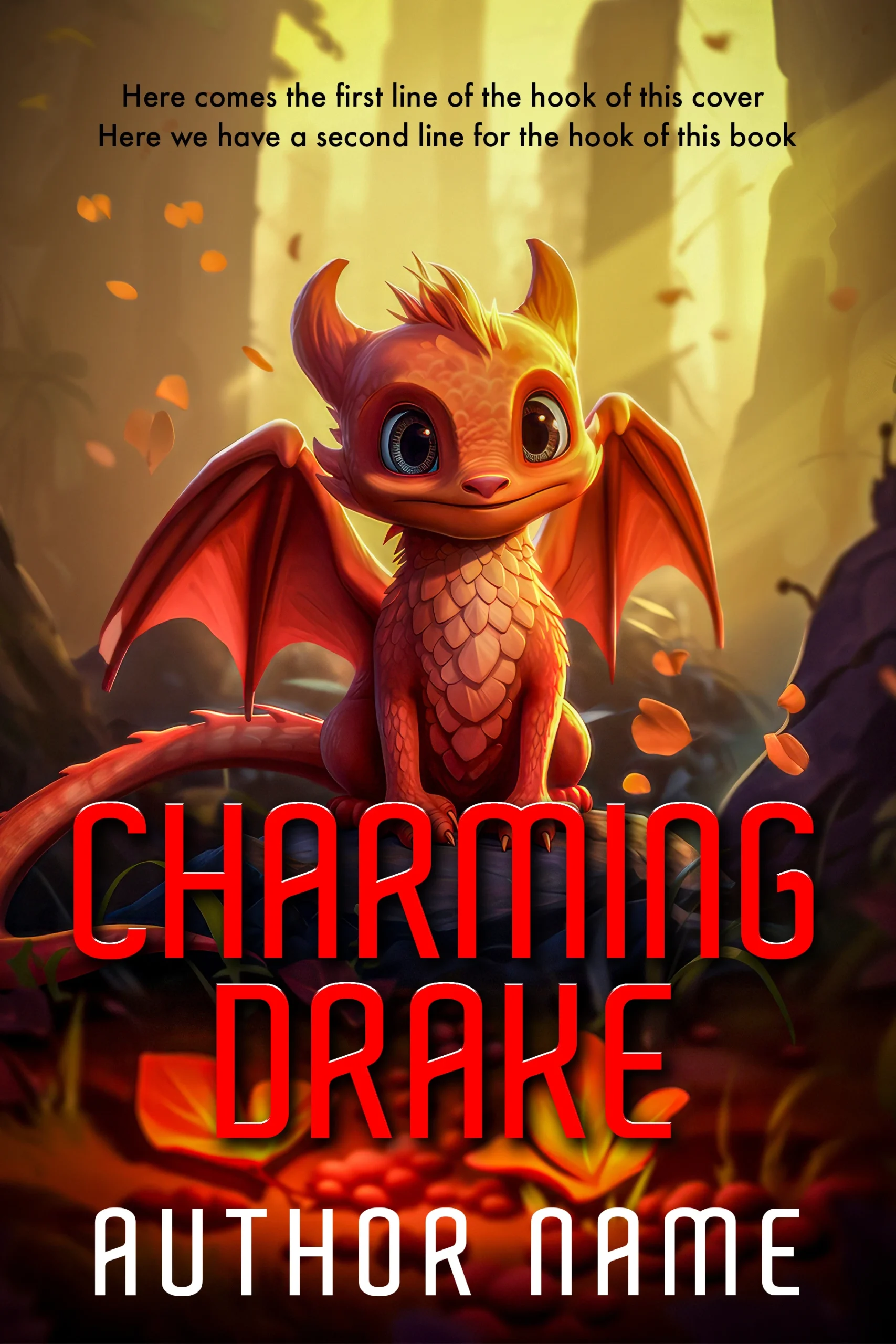
The same family one colourway over: the same rounded typeface, centred-creature layout and forest setting, with the entire palette rotated to autumn red and gold. Three levers locked plus one palette rotation is exactly how a shelf reads as one series at thumbnail size.
Lever 4: the art treatment
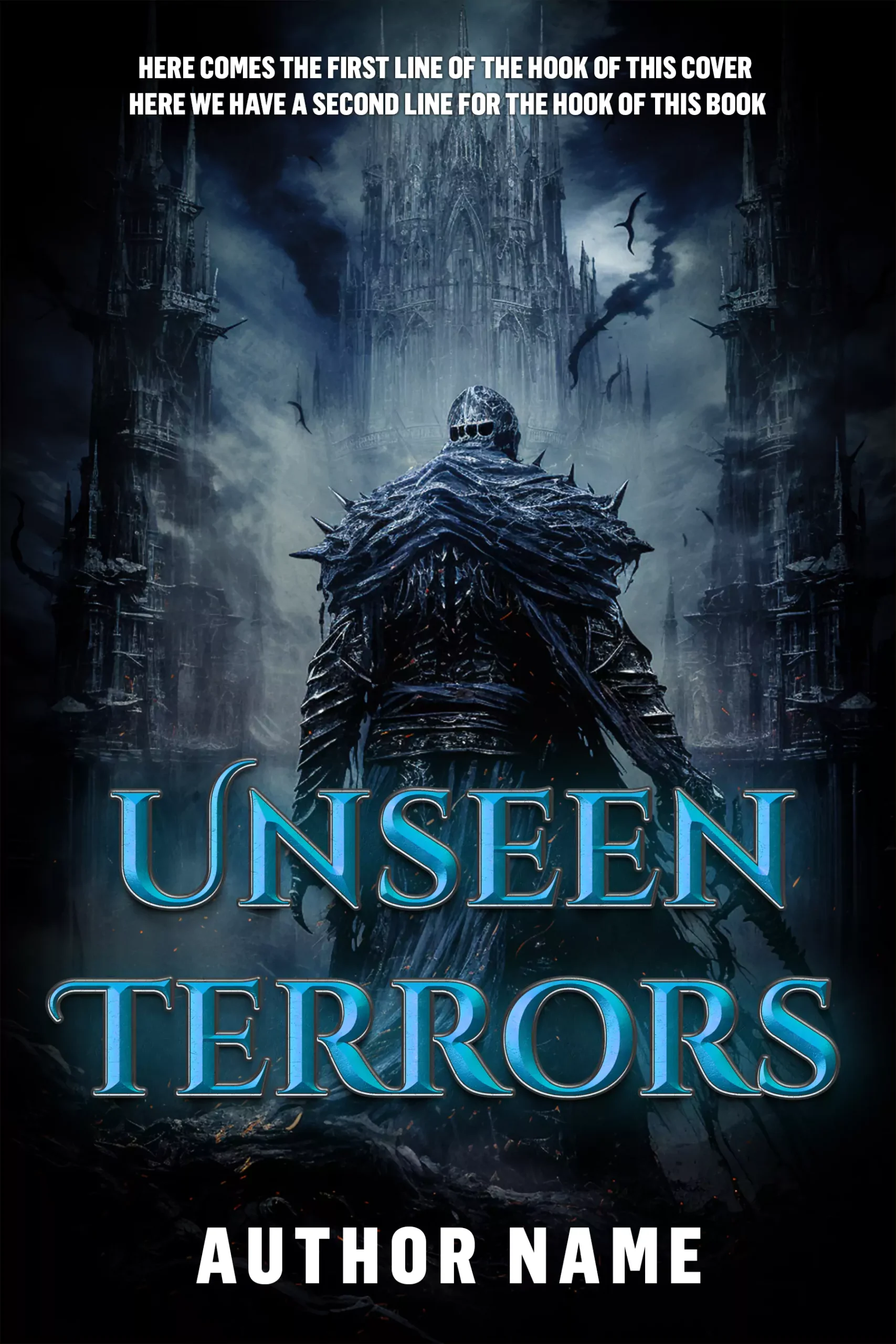
Treatment means the medium and finish, not the subject. Watercolour stays watercolour and photo composite stays photo composite. The subject inside that treatment can change completely from book to book: a knight on book one and a ruined cathedral on book two still match if both are rendered with the same brush. This is the lever authors break most often, usually by switching designers mid-series without a style reference.
Unseen Terrors
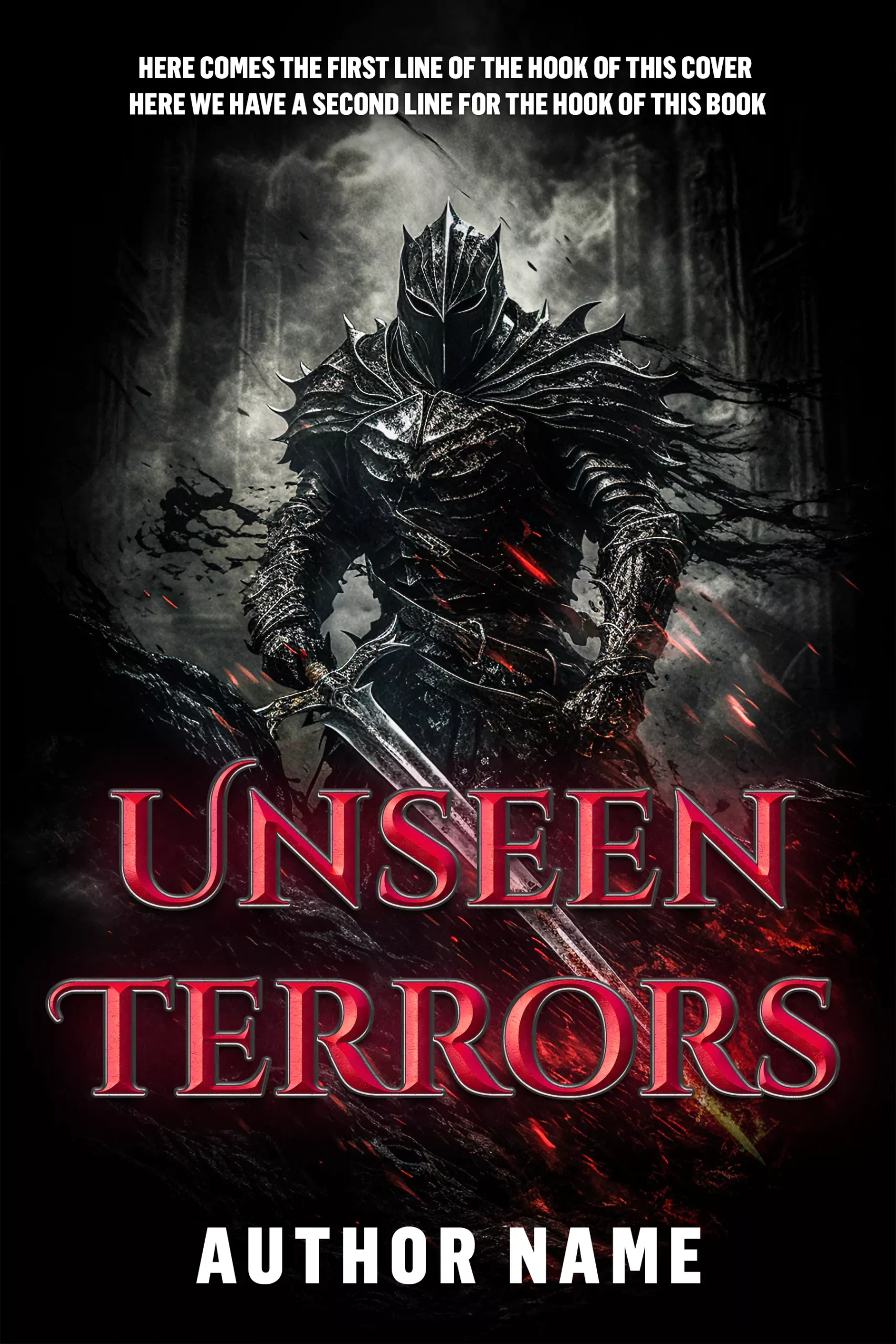
From our horror shelf: a knight in black spiked armour rests a greatsword point-down in a near-greyscale ruin scattered with red embers, and the title sits in a deep red bevelled metallic serif. That metallic title treatment is the series signature.
Unseen Terrors
Its sibling keeps the armoured figure, the darkness and the same bevelled serif, then shifts the metal finish to ice blue in front of gothic spires. Subject flexed, treatment locked: the pair still reads as one series.
How much can one book flex before the shelf breaks?
The working rule is lock three, flex one. Both pairs above flex exactly one lever, palette in the dragons and colour finish in the knights, and hold everything else. The common failure is flexing two at once: a new hue and a new title position. Each change is defensible alone; together they snap the thread.
The other trap is the slow drift rebrand, where book four quietly modernises the type. If your series needs a new look, change every published book in the same week so the shelf never shows a mixed state, and archive the old files. Our premade vs custom guide covers when a rebrand justifies its cost.
Where ready-made covers hit the series wall
Here is our honest constraint. Every premade design we sell is sold once and retired: excellent for exclusivity, awkward for series planning. Some of our shelf families are built as matching sets and can be bought together in one order, but nobody, us included, can reprint a sibling that another author already bought. A premade can absolutely start a series; it cannot always finish one.
Custom work is how a series gets guaranteed lock. Brief the set as one job and the levers get written down before any art starts: exact typeface names, hex codes for each colourway, the grid, and the art treatment references. Custom covers run $120 per ebook cover, $250 with the paperback wrap and $350 with hardback, we keep the layered source files, and the series style sheet is part of the deliverable, so book five matches book one. Pricing context sits in our cover design cost guide.
FAQ
A matched set starts with a written style sheet. Browse the fantasy and horror shelves for in-stock families, or brief the whole series as custom work from $120 per book.
Lock four things across every book: the title typeface and its position, the layout grid, the palette logic, and the art treatment. Then flex only one, most commonly a rotated dominant colour per book. Write the specs down at book one, exact font names and hex codes, so later covers can be matched even if the designer changes.
Not the same cover, the same system. Identical covers make books hard to tell apart at a glance, which costs sales. Related covers repeat the typeface, grid and treatment while changing the subject or the dominant hue, so each book looks new and unmistakably part of the set.
Yes, and successful series do it, usually when the original covers undersell the genre. Change every published book at once so readers never see a mixed shelf, keep the old files archived, and hold the new design system to the same four-lever discipline so the rebrand survives future books.
As custom work, a three-book matched set runs $360 at the ebook tier ($120 per cover) or $750 with paperback wraps ($250 per cover), with the series style sheet and source files kept for later books. Matched premade families, where a set exists in stock, run $49.99 per ebook cover.