
Quick answer
The best poetry book covers commit to one decision: a single object, a disciplined palette, a title with room to breathe. Below are 25 design lessons drawn from the covers on our own 188-strong poetry shelf, each one named so you can borrow the thinking for your collection.
Most best-of lists round up famous covers you cannot buy or study up close. This one works from inventory: our poetry book covers shelf holds 188 in-stock designs as of this update, and each lesson below is anchored in a real cover from it. For starting-point ideas organised by mood, see our poetry book cover ideas guide; this page is about why the good ones work.
Every cover shown is in stock as of this update and sold exactly once, then retired. Designer-created covers are $49.99 ebook ($99.99 with paperback); AI-assisted covers are labelled and priced at $24.99.
The quiet covers
- Let one object mourn. Grief reads strongest through a single symbol left alone in the frame: one flower, one field, quiet type.
Petals of Sorrow
Petals of Sorrow is a flat illustration of a wilting purple rose shedding red drops, on warm cream. The drip is the only violent note; the soft script title refuses to dramatise it. One object carries the register. $49.99.

- Warm the palette, keep the sorrow. Grief covers do not have to be black. Cream and warm neutrals read as memory rather than horror, which suits elegy.
- Hands change the temperature. In Blooming Silence, on the same shelf, photographs brown hands with red-painted nails offering a white daisy out of darkness. A hand holding the symbol turns an abstract cover personal.
- Small titles can outrank big ones. On quiet covers restrained type is the promise; a shouting title on a grief collection reads like a category error.
- Leave one band alone. The quiet covers that work reserve a horizontal band, usually the lowest, for nothing but field colour and the author’s name.
The layered self
- Double exposure, done warm. Filling a silhouette with imagery is the genre’s favourite identity device; it earns its place when the interior image belongs to the poems.
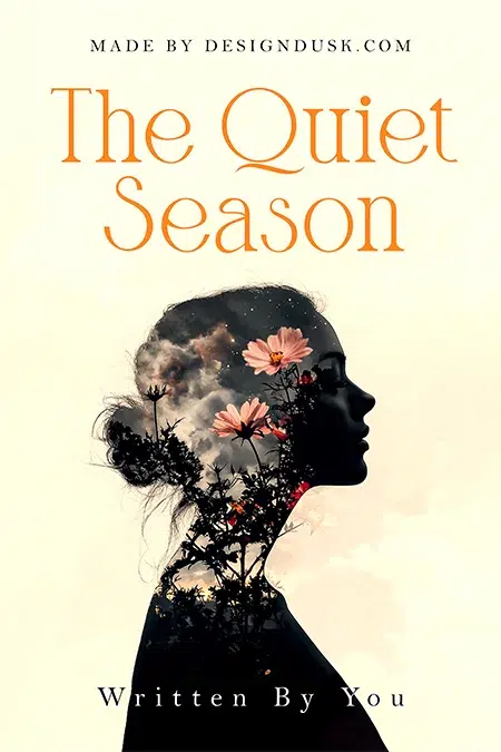
The Quiet Season
The Quiet Season fills a woman’s profile with storm clouds and pink cosmos blooms against a peach sky, with a retro orange serif above. The weather happens inside her, which is exactly the sentence the device is for. $49.99.
- Landscape as autobiography. The Nature of Memory, another shelf example, pours a mountain valley, pines and a river into a profile on an aqua gradient. Choose the landscape your poems actually visit.
- The device fails on autopilot. A silhouette filled with random stock scenery is the genre’s most common cliche. If you cannot say why that image lives inside that head, pick a different device.
- Script needs calm water. Both covers above set their type over calm zones, never the busy interior. Expressive type and expressive imagery take turns.
Collage and the modern portrait
- Cut the statue. Collage signals a collection that questions its own material.
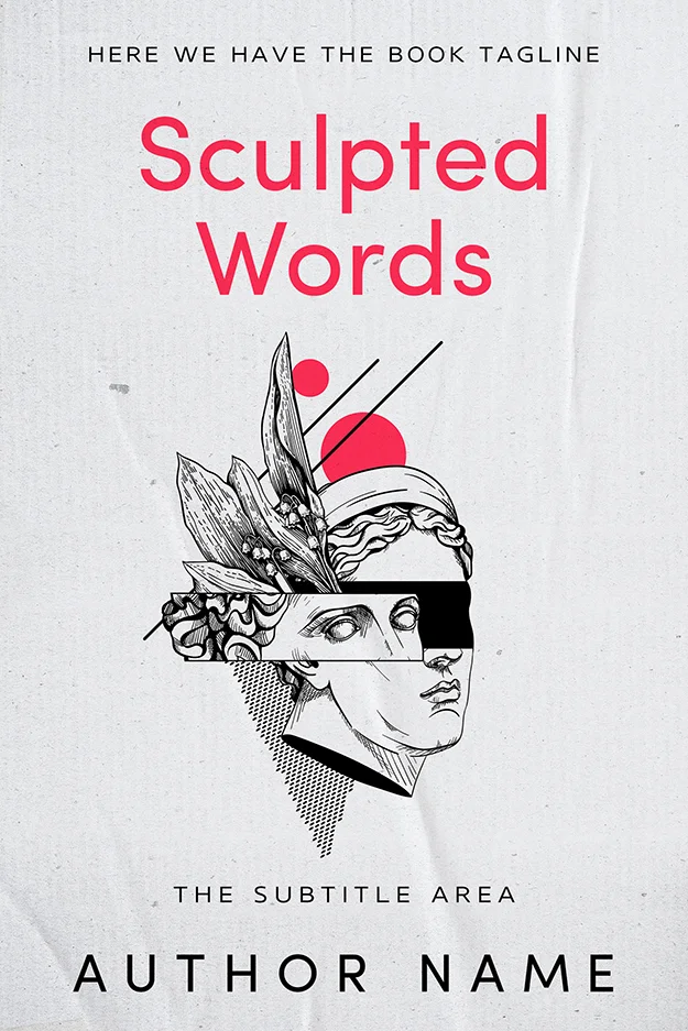
Sculpted Words
Sculpted Words slices a classical statue’s face with black bars and rebuilds it with leaves, dots and two hot pink discs, under a matching pink sans. Old material, modern cuts: the collage argues with tradition. $49.99.
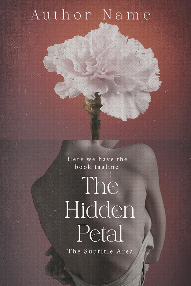
The Hidden Petal
The Hidden Petal replaces a turned figure’s head with an oversized pale carnation on a distressed maroon ground. Surrealism gives a cover one unforgettable image without illustrating any poem; the grain keeps it tactile. $49.99.
- One surreal swap is enough. The flower-for-a-head trick works because everything else stays sober; two surreal moves cancel each other.
- Keep collage palettes to three notes. Sculpted Words is paper white, ink black, hot pink. The discipline separates collage from scrapbook.
- A single colour violation. Crying Colors, also on the shelf, is a black and white macro photograph of an eye with red running from it. One colour allowed into a monochrome frame becomes the loudest thing in the aisle; spend it on the emotional centre.
Illustration that feels handmade
- Paint the feeling, not the scene. Illustration admits interpretation, and readers meet it halfway.
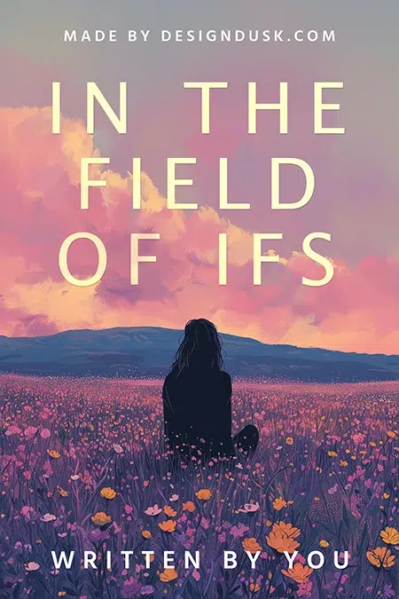
In the Field of Ifs
In the Field of Ifs seats a dark, faceless figure in a painted meadow under an enormous pink sky, then spaces its title across the clouds in tall thin capitals. The figure is anyone; the sky does the feeling. $49.99.
- The single line. Garden of Words, on the same shelf, draws a woman and her flowers in one continuous black line on blush, lips the only filled colour. One-line art says intimate and literary on the smallest ink budget.
- Frame the drawing. Lines of Grace sets its line-art figure inside a drawn arch; borders give delicate art structure at thumbnail size.
- Let the tool be the symbol. The Tears We Write, another shelf design, is nothing but an inkwell spilling red and a quill. Writing-about-writing collections can put the instrument itself on the cover and skip the metaphor hunt.
- Flat beats fussy. Flat illustration with clean shapes survives shrinking; heavily rendered digital painting usually collapses into mud at search-result size.
Photography that earns its place
- The styled flat lay. Photography works for poetry when the photograph is built, not found.
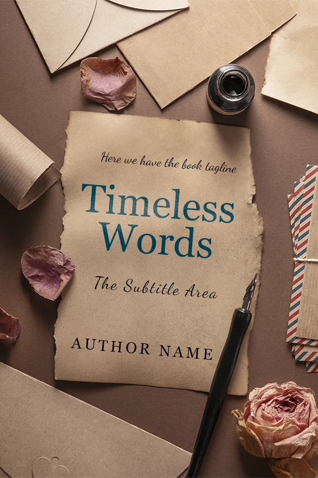
Timeless Words
Timeless Words arranges torn paper, an inkwell, a dip pen, dried petals and airmail envelopes into a desk scene, and sets the title on the paper itself. The props date the book on purpose: nostalgia is the promise. $49.99.
In the Garden of Poetry
In the Garden of Poetry photographs an open book with curling pages and red roses on white linen, then gives the lower half to an oversized red and black serif stack. Half image, half type poster: a clean template for romantic verse. $49.99.

- Split the cover in half. Image above, type below is the genre’s most reliable photographic layout: the photograph never fights the title because they never share space.
- A figure can carry drama. Most poetry covers avoid people; the exceptions commit fully.
The Poppy Season
The Poppy Season stands a woman in a sweeping red dress in a poppy field under a storm, dress and flowers sharing one red, white script tying it together. It is from our AI-assisted tier, labelled as such, priced $24.99 instead of $49.99. It also sits on our romance shelf: dramatic figure covers pull poetry toward romance buyers.
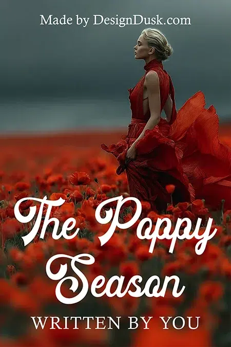
- Match the reds. Two competing colour stories look assembled; one looks directed. The dress, the field and the storm above agree on a single red.
Type and abstraction
- Type-only is a real option. A poetry cover can be nothing but a beautifully set title on a field. It works when the letterforms and spacing are genuinely excellent, and fails the moment they are merely adequate, because there is nowhere to hide.
- Abstraction outlasts illustration. Astral Tapestry, on the shelf, floats an orange textured sun over navy and coral wave bands: no scene, no figure, nothing to date. Abstraction gives wide-ranging collections a home no single image could.
- Even chaos needs a leash. Chaotic Harmony covers its field in brushstrokes, gold flecks and torn shapes, yet holds to pastel pinks, teal, black and gold. Energy on a poetry cover is fine; unmanaged energy is not.
Steal the lesson, buy the cover, or brief it custom
Every numbered lesson above is portable. If one of the covers shown fits your collection, it is in stock and sold once: designer-created designs are $49.99 (ebook) or $99.99 with paperback; labelled AI-assisted designs are $24.99. The full range is on the poetry shelf. For a specific image handled with the same discipline, custom design runs $120 to $350, and our premade versus custom guide covers which route fits.
FAQ
All 25 lessons come from live inventory: browse the poetry shelf, 188 designs in stock, each sold once. From $24.99.
One committed decision: a single symbolic object, a surreal image, a disciplined palette or an oversized title. The covers that disappear are the ones hedging between several ideas. Standing out in this genre usually means holding back harder than the covers beside you.
Usually, because white space mirrors how poetry reads on the page and buyers respond to that signal. But minimalism is a means, not the goal: collage, surrealism and photographic covers all work when they commit to one idea and a controlled palette. The failure mode is clutter, not decoration itself.
Yes. Poetry is discovered visually, at thumbnail size in online stores and social feeds, and the cover is the only part a browser sees before deciding to look closer. A cover that signals the right register to the right reader does the first half of the selling.
Our poetry book covers shelf holds 188 in-stock designs as of this update. Each is sold exactly once and then retired, so your cover is never reused. Designer-created covers are $49.99 (ebook) or $99.99 with paperback; labelled AI-assisted covers are $24.99.