
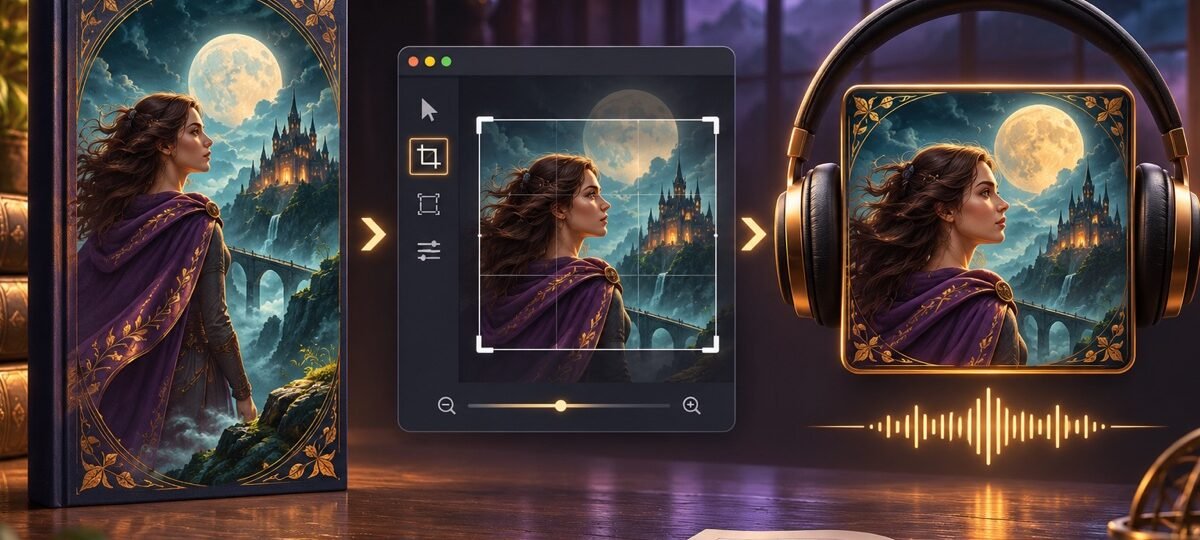
Quick answer
An audiobook cover is a square, and a straight crop of your book cover rarely survives it. Keep the focal image, cut or shrink the background, and re-set the title inside the square rather than scaling the whole thing down. ACX requires a square image of at least 2,400 x 2,400 pixels.
The spec sheet is the easy part, and ACX’s own help pages already own that search. The hard part is the design problem nobody writes about: your cover was composed for a rectangle roughly 1:1.6, and the square wants different decisions. This guide walks the rebuild in five steps, using real covers from our shelf to show which compositions survive and which need surgery. The exact pixel numbers live in our book cover size guide alongside every other format.
The example covers below come from our fantasy and romance shelves. More than 1,600 premade covers are in stock as of this update, each sold once and then retired. Designer-created covers are $49.99 for the ebook edition ($99.99 with paperback); AI-assisted covers are clearly labelled and priced at $24.99.
Why a straight crop fails
A standard ebook cover at 1600 x 2560 pixels keeps only 62 percent of its height when you crop it square at full width. More than a third of the canvas goes. Whatever lived in that third, usually the title at the top or the author name at the bottom, goes with it.
Scaling instead of cropping fails differently: the whole cover shrinks inside the square with dead bars on either side, and the title that was designed to be readable across a 6-inch-wide rectangle is now smaller than it was, in a marketplace where covers render at thumbnail size in a scrolling row. Neither shortcut works. The square is a rebuild, not a resize.
Step 1: Work out which kind of cover you have
Before touching software, look at where your cover keeps its information. Nearly every cover is one of three types, and each converts differently.
Full-bleed imagery converts easiest. When the artwork covers the whole canvas and the focal elements sit close together, a square window can hold everything that matters, and only the type needs re-setting.
The Pale Wanderer
The Pale Wanderer is the easy case. The face and the lantern, the two elements doing the work, sit together in the upper two thirds, and the artwork runs edge to edge. A square window around the face and lantern keeps the whole mood; the rough yellow lettering then re-sets inside the new frame. Designer-created, $49.99.

Stacked compositions need the full rebuild. Title in the top half, image in the bottom half: crop either half into a square and you lose the other.
Celestial Hearts
Celestial Hearts stacks a tall script title over the moonlit couple below. A square centred on the couple deletes the title; a square centred on the title keeps sky and nothing else. The audiobook version crops to the moon, couple and tree as its focal vignette, then rebuilds the script smaller and tighter in the open sky above them. Designer-created, $49.99.

Type-led covers restack. When the title is the artwork, the conversion is typographic: the same words in a squarer block.
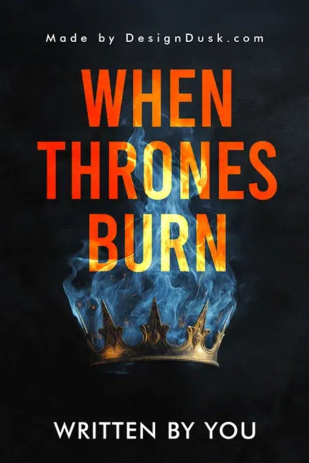
When Thrones Burn
When Thrones Burn is three stacked words over a burning crown, taller than it is wide. In the square, the title restacks into a wider, shorter block, and the crown tucks beneath it at a larger relative size. Nothing is lost; the same two elements just negotiate new territory. Designer-created, $49.99.
Step 2: Rebuild the type, never shrink it
The title on an audiobook square should usually be larger, relative to the canvas, than it was on the book. Audiobook covers live almost exclusively as thumbnails in store rows and phone apps; there is no physical edition to rescue legibility. Re-set the title inside the square, cut the subtitle if it fights for room, and keep the author name readable. If your designer has the layered source file, this is quick work. We keep layered files for every cover we build, which is exactly the situation this step assumes; if all you have is a flat JPG, expect the rebuild to cost more than the conversion itself.
Step 3: Design for the row, not the page
On retailer pages your square sits in a horizontal row of other squares, most of them loud. Two practical consequences. First, contrast at small sizes beats detail: one strong focal element against a simple field reads better in a row than an intricate scene. Second, mind the edges. Store interfaces overlay badges and stripes on cover art, and retailer interfaces can place badges near the edges. Keep type away from the extreme corners so an overlay cannot amputate a word.
Step 4: Meet the spec
The numbers, kept short because the book cover size guide holds the full table:
| Requirement | Value |
|---|---|
| Shape | Exact square, 1:1 |
| Minimum size | 2,400 x 2,400 px |
| Colour | RGB |
| Must contain | Title and author matching the audiobook metadata |
| Must not contain | Pricing, references to running time, or promotional text |
If you plan to distribute beyond ACX, check every distributor before export and build from a larger master file. Downscaling a clean master is safer than enlarging a small finished image.
Step 5: Test at thumbnail size before you upload
Shrink the finished square to around 100 pixels and look at it on your phone. Can you read the title? Does the focal element still register? Would you recognise it in a row of ten? This is the test the design either passes or fails; everything above was in service of it. If the title vanishes at 100 pixels, go back to step 2, not to the spec sheet.
Where the square comes from when you buy a cover
If you already own your cover, any designer with the layered file can run this process in an hour or two. If you are still choosing one, it is worth weighing the audiobook edition before you buy: our premade vs custom guide covers the trade-off in full, and custom design ($120 to $350) is the route when you know from day one that the design must work as a rectangle, a square and a full print wrap. A premade can absolutely convert, as the three examples above show; the covers that convert best keep their focal elements clustered rather than spread down the full height.
FAQ
— Every cover above is sold once and then retired. Browse more than 1,600 in-stock designs across the fantasy and romance shelves, from $24.99.
ACX requires a perfect square of at least 2,400 x 2,400 pixels in RGB, in JPG, PNG or TIF format, no larger than 8 MB. Other distributors publish their own limits, so export from a larger master when distributing wide; never scale a small file up.
The same design, yes; the same file, no. The rectangle must be rebuilt as a square: crop to the focal imagery, re-set the title inside the new frame, and cut elements that no longer fit. A straight centre crop usually loses the title, the author name, or both.
The common causes are a non-square file, resolution below the 2400-pixel minimum, artwork that does not match the title and author in the audiobook’s metadata, or disallowed promotional content on the art. Fixing the file against the current ACX requirements page resolves most rejections.
ACX requires the title and author on the artwork but does not list a narrator credit as mandatory; listeners still shop by narrator, so a strong narrator credit can earn its space. Add it only if the square still passes the thumbnail test with the extra line; the title and author always take priority.