
Quick answer
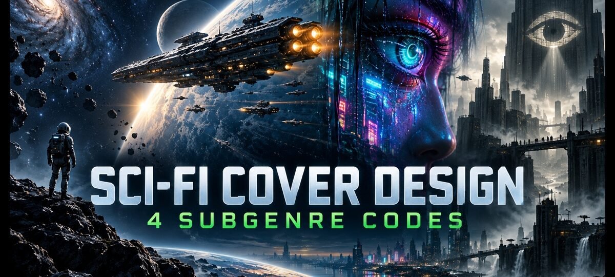
Sci-fi cover design splits by subgenre. Hard SF sells restraint: dark space, a small human figure, thin type. Space opera sells hardware in motion. Cyberpunk sells neon against black and bodies merged with machines. Dystopian sells symbols of control. Typography ages fastest, so choose a face that outlives the current trend.
Science fiction readers sort books by subgenre before they read a single word of your blurb, and they do it from the cover thumbnail. A contemplative hard SF cover on a laser-fight space opera mis-sells the book to exactly the wrong reader, and the reviews will say so. Below are the four big subgenre codes, each shown on a real cover from our shelf, plus the typography traps that date a sci-fi cover faster than anything else on it.
Our science fiction shelf holds 93 in-stock covers as of this update, and it is our best-selling genre. Every design sells once, then retires. Designer-created covers are $49.99 for the ebook file ($99.99 with paperback wrap); labelled AI-assisted covers are $24.99 ($59.99 with paperback).
1. Hard SF: restraint is the signal
Hard SF readers are buying rigour. The cover code that promises it is almost monastic: a black or near-black field, one human element rendered small against something enormous, a single accent colour, and thin, widely spaced capitals. No explosions, no monsters, no clutter. The restraint itself is the genre signal, the visual equivalent of an author who did the math.
The Silent Expanse
The Silent Expanse is the code at its cleanest: one drifting astronaut, black space, and a title in thin spaced capitals with a single word picked out in yellow. Nothing on the cover raises its voice, which is precisely what tells a hard SF reader this book is for them. At thumbnail size the astronaut shrinks to a white mark in a black field, and it still works.

The same restraint carries literary SF and first-contact stories. If your book is quiet, let the cover be quiet; the readers you want are looking for exactly that on our science fiction shelf.
2. Space opera: hardware in motion
Space opera promises scale, speed and allegiance, and its cover code delivers all three through hardware. The conventions: a ship (or fleet) rendered with visible detail, a planetary arc or horizon to establish scale, warm engine glow set against cold space, and bold condensed capitals, very often in gold or amber. The warm-against-cold contrast is doing the emotional work: engines mean people, and people mean stakes.
Starlight Armada
Starlight Armada runs the full kit: a gunmetal warship crossing the terminator line of a planet at dawn, engine pods glowing amber, and a golden condensed title stacked two lines deep across the sky. The ship angles toward the viewer rather than sitting in profile, which reads as motion even in a static thumbnail. This is the cover a military SF reader clicks on reflex.

3. Cyberpunk: neon against black
Cyberpunk’s code is the most colour-locked in science fiction: cyan and magenta neon against charcoal and black, plus the seam where the body meets the machine. Faces matter here more than ships. The subgenre is about what technology does to people, so the strongest covers put a person (or something person-shaped) close to the lens and let the technology show through the skin.
Beyond the Neon Eye
Beyond the Neon Eye crops a black wireframe face so close it bleeds off the left edge, with one eye burning cyan and a techno sans title in the same blue. One light source, one colour, one idea: the machine is looking back. The half-face composition leaves the right side of the cover clear, so the title never fights the art.

A practical warning: full neon cityscapes are gorgeous at full size and turn to mush at 120 pixels. If you go the city route, make sure one element (a figure, an eye, a sign) survives the shrink.
4. Dystopian: the symbol of control
Dystopian covers sell the system, not the hero. The code is built on repetition and symbols: crowds of identical figures, surveillance imagery, propaganda-poster framing, and a disciplined palette of black, white and one totalitarian accent (red, most often). If the reader can feel the boot before reading the blurb, the cover has done its job. Our dystopian shelf holds 18 in-stock designs built on exactly these codes.
Televised Minds
Televised Minds is pure dystopian grammar: a monochrome crowd of figures with television sets for heads, one standing slightly forward, and a heavy slab title in red, the only colour on the cover. Repetition does the world-building and the single red accent does the menace. It reads perfectly at any size because it is built from three tones.

Metropolitan Threat
Metropolitan Threat plays the invasion end of dystopia: a rain-slicked street in sickly green-teal, taillights below, and a vast saucer clamped around a skyscraper above. The single-hue grade holds the chaos together, and the tall white capitals stay legible against the busiest part of the image. This one is from our AI-assisted line, labelled as such, at $24.99.

The typography that dates a sci-fi cover
Nothing ages a sci-fi cover faster than its type. Chrome bevels say 1985. Rounded “computer” faces say 1999. Aggressive laser-gradient chrome is already saying 2021. Two safer routes: geometric sans faces (the space opera and cyberpunk standard) and thin spaced serifs or sans (the hard SF standard), both of which have survived decades of shelf turnover.
The current wave is glitch treatment: clean letterforms with RGB colour fringing, as if the cover itself has a transmission error.
Where the Stars Begin
Where the Stars Begin sets huge stacked capitals with red and green channel offsets over a nebula sky, above a tiny figure in a yellow jacket on a dark rock. The glitch type carries the science fiction signal, which frees the image to be pure wonder. Fashion-forward type like this converts hard right now; just go in knowing every trend eventually becomes a timestamp.

The four codes side by side
| Subgenre | Palette | Subject | Typography |
|---|---|---|---|
| Hard SF | Black plus one accent | Small human vs enormous space | Thin, spaced, quiet |
| Space opera | Cold space, warm engine glow, gold | Ships, fleets, planetary arcs | Bold condensed capitals |
| Cyberpunk | Cyan and magenta on black | Faces, body-machine seams | Techno sans, neon fills |
| Dystopian | Black, white, one red | Crowds, symbols of control | Slab or poster capitals |
Where sci-fi shades into fantasy
Dragons on spaceships, magic in megacities: science fantasy borrows both wardrobes. The working rule is to style the cover for the shelf you want to be found on. If your book leans toward the fantasy end, the subgenre code map in our fantasy book cover design guide covers that side of the border.
Buying a sci-fi cover instead of briefing one
Every cover above is in stock today and sells exactly once; when it is gone, no other book wears it. Designer-created premades are $49.99, AI-assisted (always labelled) $24.99, and both carry print-wrap tiers. If your book needs a specific ship, city or scene the shelf does not hold, custom design runs $120 for ebook, $250 with paperback, $350 with hardback. Deciding between the two routes is its own question; our premade versus custom guide walks through it.
FAQ
Browse all 93 in-stock designs on our science fiction shelf. Each cover sells once. From $24.99.
Subgenre accuracy first: the cover must signal hard SF, space opera, cyberpunk or dystopian at thumbnail size, because readers filter by those codes before reading a blurb. Then one dominant idea, a disciplined palette, and typography that stays legible at 120 pixels. Detail that vanishes when shrunk is decoration, not design.
Each subgenre has its own palette. Hard SF runs black with a single accent. Space opera pairs cold blues with warm engine golds. Cyberpunk is locked to cyan and magenta neon on black. Dystopian works in black and white plus one authoritarian red. Crossing palettes usually means mis-signalling the subgenre.
Only if ships are central to the story. A ship promises space opera or military SF, and readers will hold you to it. Character-driven, near-future and cyberpunk stories usually sell better behind a figure, a face or a symbol. Match the promise on the cover to what the book actually delivers.
Premade sci-fi covers on our shelf are $24.99 for labelled AI-assisted designs and $49.99 for designer-created, each sold once and then retired. Paperback wrap tiers are $59.99 and $99.99. A custom sci-fi cover built to your brief runs $120 to $350 depending on format.