
Quick answer
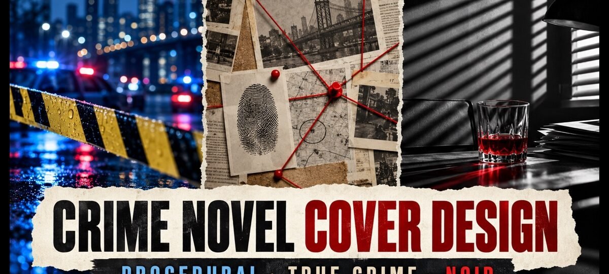
Police procedurals sell order restored: badges, tape, city light and clean bold sans type. True crime sells evidence: documentary photos, newsprint textures and stark typewriter or tabloid type. Noir sells mood: shadow, one red accent and stylish period lettering. Pick the code your readership already trusts before you brief a single image.
“Crime” on a cover brief hides three different readerships. Procedural readers want competence and closure. True crime readers, and the novelists borrowing their shelf, want documentary evidence. Noir readers want atmosphere and moral rot. The most common thing we fix in a brief is an author asking for “something dark and crimey” when the book is squarely one of these three, because the market you pick decides every visual choice that follows.
Every cover shown is in stock on our crime shelf as of this update (79 designs), sold exactly once and then retired. Designer-created premades are $49.99 for the ebook cover; the one AI-assisted pick below is labelled and priced at $24.99. Paperback and hardback tiers add the full print wrap.
One word, three different books
Put a procedural, a true-crime-styled novel and a noir side by side and almost nothing carries across: not the palette, not the type, not even how much light is in the frame. That is not designers being precious. Each readership has spent years learning its own shelf, and the cover’s first job is to be findable by the right one. A noir cover on a procedural loses the procedural reader without gaining the noir one. Before briefing anything, browse a shelf sorted by real inventory, like our crime covers, and notice how cleanly the three codes separate.
What does a police procedural cover look like?
The procedural promises a case worked and closed by someone competent. Its covers lean on authority markers: police tape, patrol lights, a figure who is clearly an investigator rather than a victim. Palettes run cold, mostly blues and steel greys, with one warning colour doing the emotional work. Type is heavy, condensed and confident, because the genre’s promise is confidence.
Crossing the Line
Crossing the Line is the code at full strength: a weathered investigator stares down the reader while a POLICE LINE DO NOT CROSS band runs the full width of the frame. The tape is the genre handshake, the trench coat says decades on the job, and the distressed red capitals promise this case will cost him something. Nothing on the cover is decorative.

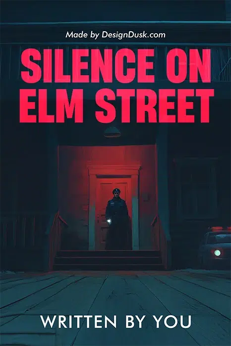
Silence on Elm Street
Silence on Elm Street shows the illustrated end of the same code: a lone officer in a doorway that glows like a wound, patrol car half in frame, one street on one night. The teal-and-red palette keeps it cold with a single warning accent, and the oversized pink-red block title works at any thumbnail size. AI-assisted, labelled, and priced accordingly at $24.99.
Procedurals sit on the border of the thriller shelf, and plenty of readers shop both; if your book leans harder on pace than on process, compare the codes on our mystery and thriller shelf before choosing.
What does a true crime style cover look like?
True crime proper is nonfiction, but a growing slice of crime fiction borrows its look: novels framed as case files, podcast transcripts or reconstructed investigations. The borrowed code is documentary restraint. Light backgrounds where the other two codes go dark. Evidence textures: newsprint, file stamps, photo corners, spatter used sparingly and forensically. Type that reports rather than performs, thin capitals or typewriter faces, with red reserved for one clinical touch.
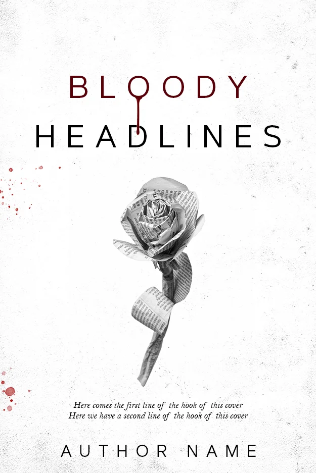
Bloody Headlines
Bloody Headlines is the documentary code distilled: a stark white field, reportage typography with a single controlled drip, and a rose built out of newsprint. The newspaper texture does the genre work, promising a story assembled from the record, and the restraint is what makes the two touches of red feel forensic instead of lurid.
Black and White Justice
Black and White Justice runs the evidence-photo version: a monochrome frame that reads like case documentation, with the title stacked in black, red and white capitals. The greyscale treatment is the signal, because colour is emotion and true crime style claims to be past emotion. One word in red carries the verdict.

If your novel borrows this shelf, commit to it. A documentary cover with a moody noir figure pasted in reads as neither. More framing devices for evidence-led covers are in our book cover design ideas guide.
What makes a cover noir?
Noir sells mood before plot. Shadow is the main subject: silhouettes, half-lit faces, smoke, wet streets. The palette is black plus one permission, almost always red, occasionally sepia when the story is period. Props are talismans, the cigarette, the hat, the glass, the revolver. Type is where noir shows off, tall elegant serifs, deco lettering or scratched capitals, never a neutral corporate sans.
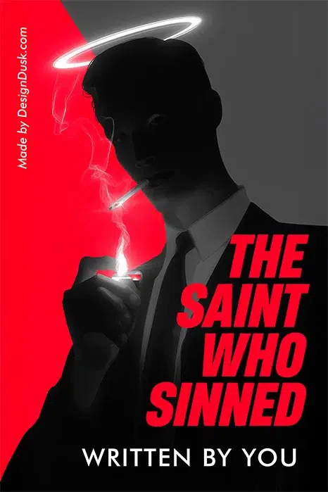
The Saint Who Sinned
The Saint Who Sinned compresses a whole noir morality play into one image: a faceless man in a suit, cigarette smoke curling through a neon halo that his silhouette does not deserve. The hard red-grey split behind him is the genre’s moral ledger, and the leaning red capitals promise style with the rot.
Sleuth in Sepia
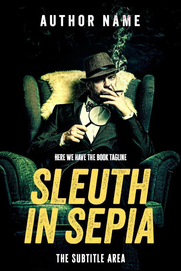
Sleuth in Sepia is the classic-detective flavour: hat, cigar, magnifying glass and a wingback chair, graded into a smoky green-sepia that sets the story fifty years back. Every prop is period-correct signalling, and the distressed gold capitals read like a pulp paperback that survived the decades.
Behind the Trigger
Behind the Trigger goes full pulp: a hand and smoking revolver rendered as a white ink woodcut against mottled red and black. The two-colour discipline is the lesson, one image, one accent, one elegant serif, and the printmaking texture gives it the period voice a photograph never could.

The three codes side by side
| Element | Police procedural | True crime style | Noir |
|---|---|---|---|
| Palette | Cold blues and greys, one warning colour | Light field, greyscale, clinical red | Black, one red accent, sepia for period |
| Imagery | Tape, badges, patrol light, the investigator | Newsprint, file stamps, evidence photos | Silhouettes, smoke, props, wet streets |
| Typography | Heavy condensed sans, distressed caps | Typewriter faces, thin reportage caps | Tall serifs, deco lettering, scratched caps |
| Promise | A case worked and closed | The facts, assembled | Atmosphere and moral rot |
| Kills the sale | Whimsy, warm pastels | Melodrama, glossy staging | Neutral corporate type, daylight |
Which code should your cover follow?
Ask where your ideal reader already shops, not which aesthetic you like most. If your detective follows procedure and the ending restores order, take the procedural code. If your novel wears the machinery of reportage, take the documentary code. If the mood would survive losing the plot, take noir. Our crime shelf holds all three ready to buy from $24.99, and when the book needs a specific scene or a series look, custom design runs $120 to $350. Deciding between the two routes is its own question; our premade versus custom guide walks the trade-off, and the full price landscape is in book cover design cost.
FAQ
All 79 crime covers are in stock and sold once each, from $24.99. Need a specific scene, a series look or a face you own the rights to? Custom crime covers run $120 to $350.
It should follow the code of its specific crime market. Procedurals use authority markers, cold palettes and heavy sans type. Documentary-styled crime uses light fields, evidence textures and reportage type. Noir uses shadow, one red accent and stylish period lettering. A generic “dark cover with a weapon” belongs to none of the three and sells to none of them.
True crime covers claim factual authority: light backgrounds, documentary photography or newsprint textures, restrained typewriter-style typography and clinical use of red. Crime fiction covers are freer to dramatise with staged figures, saturated colour and expressive type. Novels styled as case files deliberately borrow the true crime code, and the borrowing only works when the restraint is total.
Procedurals run cold blues and steel greys with a single warning colour, usually red or yellow. Documentary-styled covers run white, grey and black with forensic touches of red. Noir runs black with one saturated accent, or sepia tones for period stories. Across all three, discipline beats variety: one accent colour doing one job.
Noir usually should not: silhouettes and half-lit profiles keep the mood ambiguous, and a fully lit face breaks it. Procedurals can show the investigator when the series sells on that character. Documentary-styled covers avoid staged faces because posed emotion undercuts the factual claim. When in doubt, obscure: shadow, distance or turned backs all keep tension.