
Quick answer
A thriller cover needs three elements: one dominant subject, one void that isolates it, and one wrong note that signals danger. Everything else is subtraction. Each subgenre tunes those elements differently: domestic thrillers use quiet houses, psychological thrillers trap a face, spy covers keep figures walking away. Test everything at thumbnail size.
Thriller is the most crowded shelf in fiction and the least forgiving of a busy cover. After building the 186 designs currently on our mystery and thriller shelf, we can reduce what actually works to three elements: one subject, one void, one wrong note. Below is the method, then how five thriller subgenres tune it, each shown on a real in-stock cover.
Our mystery and thriller shelf holds 186 covers as of this update, each sold once and then retired. Designer-created covers are $49.99 ebook / $99.99 with paperback wrap; the labelled AI-assisted tier is $24.99 / $59.99.
The three elements
One subject
A thriller cover shows one thing: a house, a face, a figure, a weapon. Two subjects split the tension in half. If your scene needs three characters and a burning car to explain, it belongs on the back cover blurb, not the front.
One void
The subject earns its menace from what surrounds it: darkness, fog, an empty sky, a wall of colour. The void is where the reader’s imagination does the work, so give it at least half the canvas.
One wrong note
This is the element beginners skip. Something small must be off: a light on in an empty house, a halo over a smoker, a mask where a face should be. The wrong note is the promise of the plot. More starting points live in our book cover design ideas guide.
What makes a domestic thriller cover work?
The domestic thriller sells the fear that the ordinary is lying to you, so the subject is deliberately mundane and the wrong note is tonal: light, weather, emptiness. Houses, porches and lit windows are the quiet backbone of our mystery and thriller shelf.
The Silent Porch
The Silent Porch is the formula at its cleanest: an ordinary weatherboard house, centred and small, under a moonlit sky that takes up two thirds of the canvas. The palette never leaves cold blue-grey, and the tall thin serif floats in the sky rather than shouting. Nothing is visibly wrong, which is exactly the point: the mist and the dark doorway make an ordinary porch feel like a held breath.

Psychological thrillers: trap the face
Psychological thrillers put the danger inside a person, so the subject is a face and the void presses in on it. Both examples below keep the camera close and let the treatment of the face carry the subgenre signal.
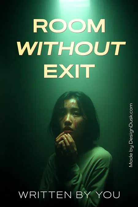
Room Without Exit
Room Without Exit runs a single sickly green light from above, which reads institutional: interrogation room, cell, hospital. The kneeling figure and clasped hands signal captivity without showing a captor, and the heavy cream slab title with its red outline presses down like a ceiling. Green is an underused thriller colour and instantly separates this cover from the black-and-red crowd.
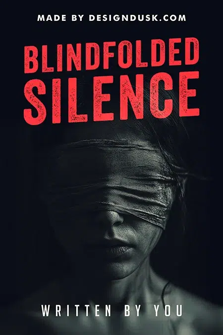
Blindfolded Silence
Blindfolded Silence is the monochrome version of the same move: strip the photo to black and white, blindfold the subject, and spend your entire colour budget on distressed red type. The blindfold does double work, victim and unreliable witness at once. One subject, a black void, and red as the only wrong note.
Spy thrillers: keep the figures moving away
Espionage covers are the exception to the single-figure rule, but only just: figures appear in silhouette, at distance, walking away. Identity withheld is the genre promise.
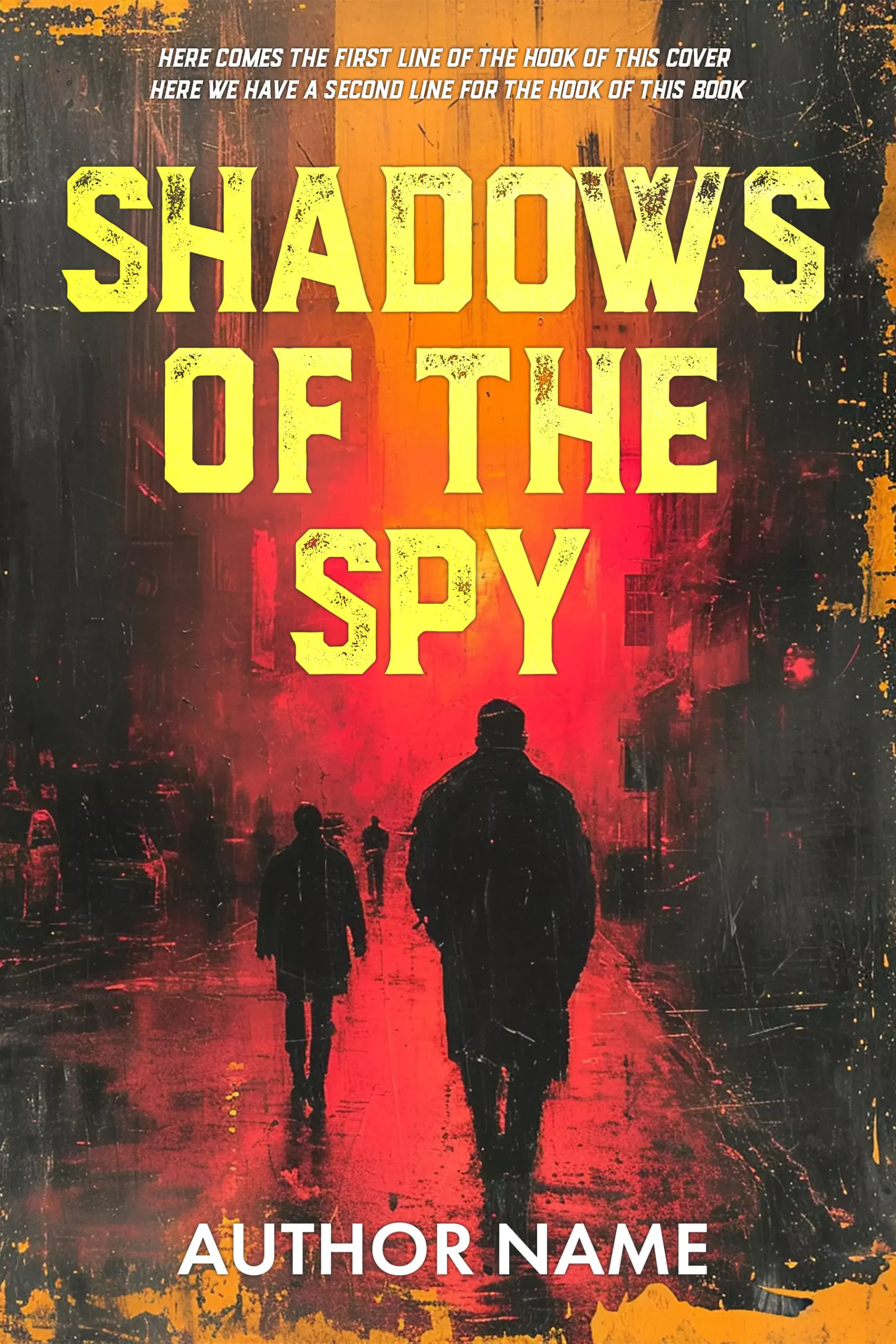
Shadows Of The Spy
Shadows Of The Spy stages three silhouetted figures on a rain-slick street dissolving into a red-amber haze, painted rather than photographic, with heavy grunge texture over the whole frame. The distressed mustard capitals feel like a stamped dossier. Nobody has a face, and the light source burns at the end of the street like something you are being walked toward.
Techno thrillers: cold light, hidden source
Techno and cyber thrillers signal through light temperature. Screens, LEDs and neon read as technology even when no computer is on the cover.
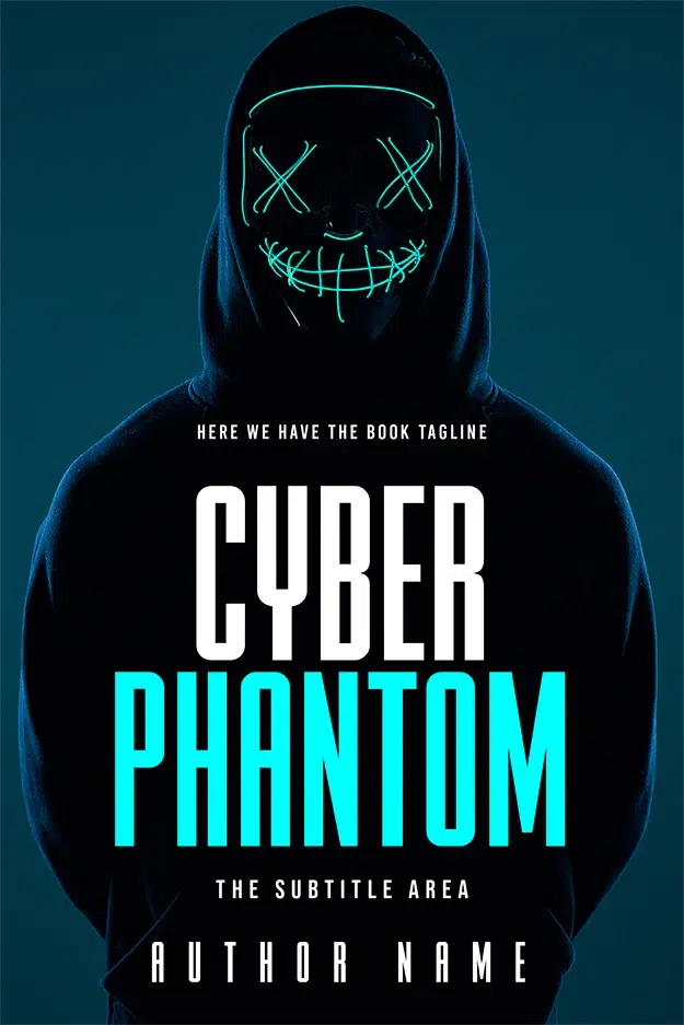
Cyber Phantom
Cyber Phantom hides its subject inside a hoodie and replaces the face with a neon LED mask, X eyes and a stitched grin, on a near-black teal field. The geometric sans title in white and cyan matches the light source, which keeps the whole cover in one temperature. A face you cannot arrest: that is the techno thriller promise in one image.
Military and action thrillers: hardware is the promise
Action buyers want competence and firepower on the cover, so the wrong note flips: here the hardware is the subject and the void stays disciplined around it.
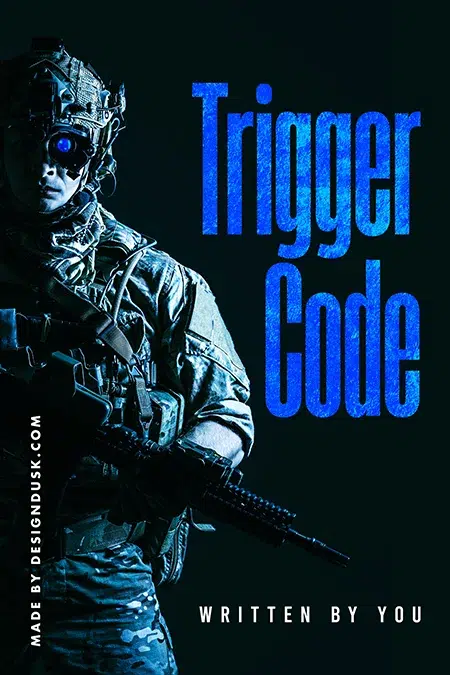
Trigger Code
Trigger Code puts a fully kitted operator against pure black with one glowing blue optic where his eye should be. The blue wash unifies figure and type, and the textured condensed capitals stack like a callsign. Note what is missing: no explosion, no landscape, no team. One soldier, one void, one point of light.
Noir and crime crossovers: one ironic detail
Where thriller shades into crime fiction, covers get wittier. The wrong note becomes a visual joke the reader is trusted to catch. Our crime shelf runs 78 covers deep in this register.
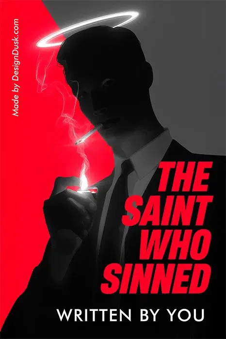
The Saint Who Sinned
The Saint Who Sinned is built on one contradiction: a glowing halo floating over a silhouetted man lighting a cigarette. The hard diagonal split of red and grey behind him does the moral geometry for you. Heavy red slab capitals stack down the right edge like a verdict. Remove the halo and this is a generic noir figure; the wrong note is the whole cover.
Do thriller covers have to work at thumbnail size?
Yes, and this is where the three-element rule earns its keep. Most buyers first meet your cover as a thumbnail smaller than a postage stamp in a search grid. At that size, a one-subject cover with a strong void survives; a montage becomes mud. Shrink any cover you are considering to phone-icon size and check three things: the subject still reads, the title is still legible, and the wrong note still registers. Exact pixel dimensions for every retailer are in our book cover size guide.
Premade or custom?
If your thriller fits a recognisable subgenre, a premade is the fast road: every design above is in stock, sold once and retired, from $24.99 on the AI-assisted tier and $49.99 designer-created. If your plot hinges on a specific object or setting the shelf does not hold, custom design runs $120 for ebook, $250 with paperback, $350 with hardback. The honest comparison between the two routes lives in our premade vs custom guide.
FAQ
One dominant subject (a figure, house, face or object), a large area of visual quiet around it, and a single detail that feels wrong: a lit window, a mask, an out-of-place colour. Add a title strong enough to read at thumbnail size and stop there. Crowded covers read as self-published; restraint reads as threat.
Black, deep blue and cold grey are the base register, with red as the standard danger accent. Sickly green signals psychological or institutional dread, amber haze suits espionage, and neon cyan reads techno. Pick one base and one accent; thriller covers lose tension when a third colour joins.
Thriller covers promise danger in motion: figures, weapons, hard type, high contrast. Mystery covers promise a puzzle: objects, clues, fog, quieter typography. The overlap is large, which is why our shelf combines both genres, but a good designer will ask which feeling your final chapter delivers and build toward that.
On our shelf, a designer-created premade thriller cover is $49.99 for ebook or $99.99 with a print wrap, and labelled AI-assisted designs start at $24.99. Custom thriller covers run $120 to $350 depending on format. Each premade is sold exactly once, so no other thriller will wear your cover.