
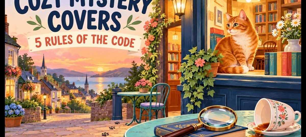
Quick answer
Cozy mystery covers follow the strictest code in fiction: a warm lit scene, flat or painterly illustration, a murder reduced to a wink (a knocked-over teacup, not a body), rounded pun-friendly lettering, and a series template that never moves. Break any one rule and cozy readers scroll past without slowing.
Cozy readers are the most code-literate buyers in crime fiction. They are shopping for a feeling, a small town where the worst thing that happens is solved by book’s end over baked goods, and they can spot a fake from a thumbnail. The five rules below are the whole code. We will be straight with you about our own shelf while we teach them.
Our mystery and thriller shelf holds 186 covers as of this update, each sold once and then retired, from $24.99 (AI-assisted, labelled) and $49.99 (designer-created) for the ebook tier. An honest caveat: the genuinely cozy corner of that shelf is currently thin, so the examples below are the covers that come closest to each rule, and for a true cozy we point you to custom at the end.
Rule 1: The lights are on
Thrillers sell darkness; cozies sell warmth. The palette starts from cream, butter yellow, sage, coral and robin’s-egg blue, and even night scenes are lit like a shop window. The reader should feel the radiator through the cover. Menace, where it appears, is a shadow at the edge of a sunlit frame, never the frame itself.
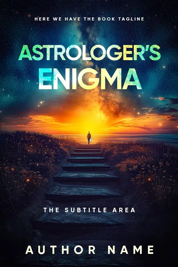
Astrologer’s Enigma
Astrologer’s Enigma is the warmest mystery frame on our shelf and shows what light does to threat: stone steps, wildflowers, a glowing horizon and a sky full of stars. A figure walks alone at dusk and it still reads as an invitation. Swap the painterly finish for flat illustration and this composition would sit happily on a paranormal cozy about a seaside astrologer.
Warmth is also the fastest self-test: shrink your draft cover to thumbnail and ask whether it promises comfort or dread. More palette starting points are in our book cover design ideas guide.
Rule 2: Illustration, not photography
The modern cozy is illustrated, almost without exception: flat or lightly textured vector-style art, painterly gouache, or hand-drawn scenes. Illustration lowers the threat level in a way photography cannot, because a drawn knife is a joke and a photographed knife is a weapon. It also gives the cat somewhere to sit. Photographic covers push the same story toward suspense.
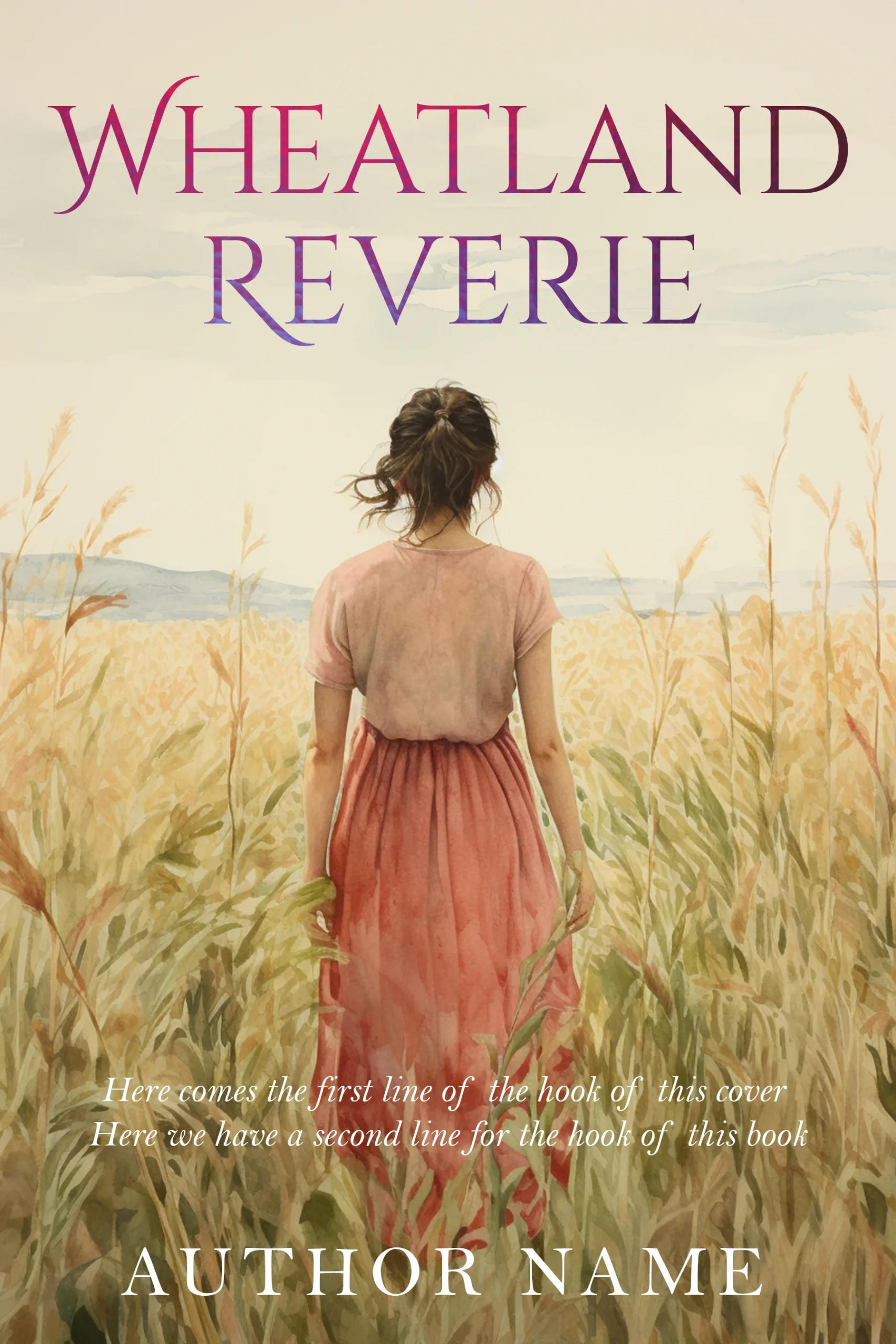
Wheatland Reverie ”Book 1”
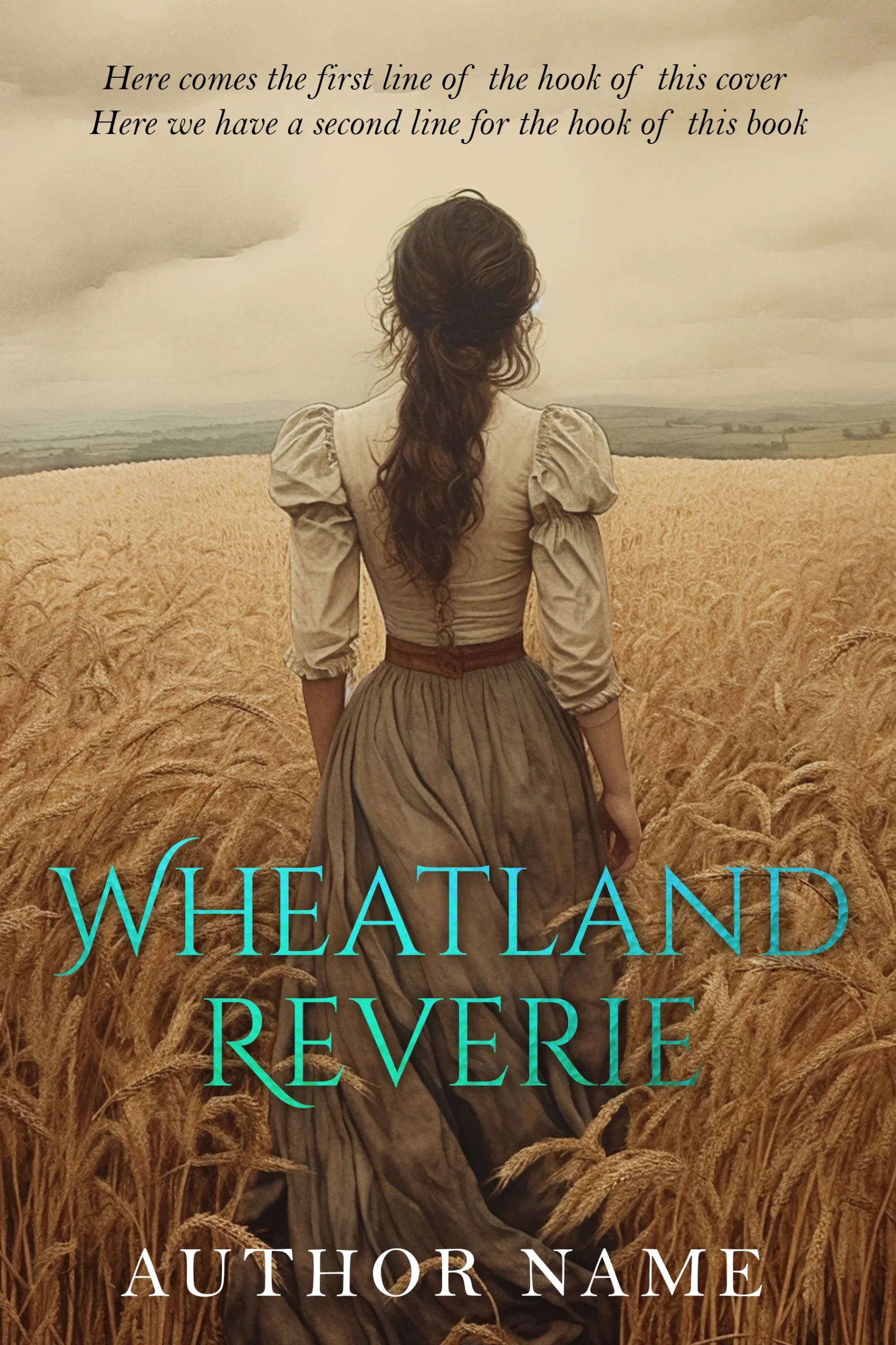
Wheatland Reverie “Book 1” is the closest thing we stock to cozy rendering: loose watercolour, soft light, a heroine facing away into a gentle landscape. Nothing here threatens. The lesson for a cozy author is the finish, not the subject: this exact warmth in flat illustration, plus a village and one suspicious detail, is the code readers expect.
Here is the honest bit: we do not currently hold a true flat-illustration cozy, the kind with a cat on a bakery counter, in stock. When authors need one, we build it as a custom cover from $120, illustration style agreed up front.
Rule 3: The murder is a wink
There is always a death, and the cover treats it as a puzzle piece, never a wound. The genre’s visual vocabulary is the knocked-over teacup, the knitting needle in the wrong place, the cat pawing at a clue, the one slice missing from the pie at the fete. Blood, weapons pointed at anyone, and frightened faces are all disqualifying. The crime is present the way it is present in the books: politely.
The Silent Porch
The Silent Porch teaches the rule by contrast. The subject could not be more cozy: a farmhouse porch in a quiet town. But the moonlit blue-grey palette and creeping mist push it firmly to the suspense shelf. Same porch at golden hour in flat illustration, with a cat on the steps and one door suspiciously ajar, and it becomes a cozy. Palette and rendering decide the shelf; the subject never does.

If your story genuinely runs darker than a wink, you may be writing a traditional mystery or soft-boiled crime instead; compare codes on our crime shelf before committing.
Rule 4: Type you could paint on a tea tin
Cozy titles are typographic comfort food: rounded serifs, friendly scripts, hand-lettering with a little bounce. The title is often a pun, so the type has to be in on the joke; a stern condensed sans would read like the punchline delivered by a coroner. Author name small and warm, title large and playful, and series branding somewhere permanent.
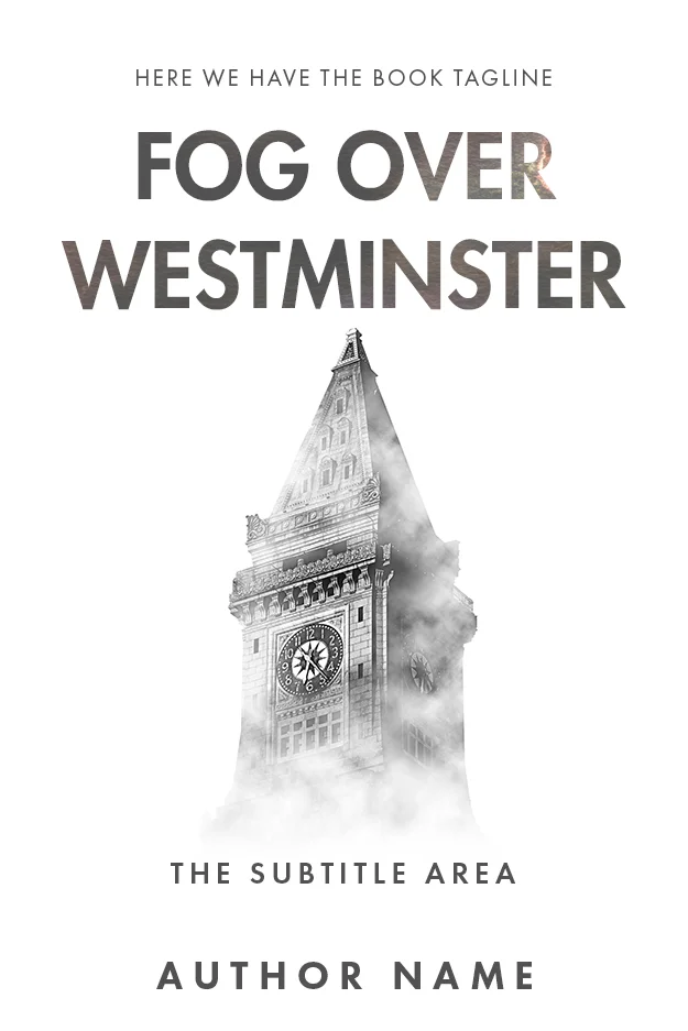
Fog Over Westminster
Fog Over Westminster sits halfway between codes and shows why type carries so much weight. The light field and gentle fog are almost cozy; the cool grey capitals are not, and they tip the whole cover toward traditional British mystery. Reset this exact composition in a warm hand-lettered serif with a cat silhouette on the tower ledge and the shelf changes instantly.
Rule 5: The series template never moves
Cozies are series machines, and cozy readers buy the row, not the book. That makes the series template sacred: same illustration style, same title placement, same author name treatment, same spot for the series name and number, with only the scene and accent colour rotating. Book four should be identifiable from across a room as belonging to books one through three.
Wheatland Reverie Trilogy “Book 2”
Wheatland Reverie Trilogy “Book 2” is a useful cautionary pair with Book 1 above. The world carries over beautifully, same wheat, same lone heroine, same serif class. But the title moves from top to bottom and changes colour from plum to teal, which is more drift than a cozy series can afford. In cozy, the reader should be able to find the title with their eyes closed.
This is also where sold-once premades need an honest explanation. Every premade we sell is retired at sale, which is excellent for book one and a real question for book two. The answer: bring book one back to us as a custom brief. Matching an established template is the most predictable kind of custom work, and it is how a one-off premade becomes a series look. The trade-offs of starting premade versus starting custom are covered in premade versus custom.
Cozy, traditional or thriller? A ten-second check
| Cue | Cozy | Traditional mystery | Thriller |
|---|---|---|---|
| Palette | Warm pastels, lit windows | Muted, restrained, light field | Dark, cold, one warning colour |
| Rendering | Flat or painterly illustration | Photography or quiet photo-collage | High-contrast photography |
| The crime | A wink: teacup, missing pie | Implied, off-frame | Centre stage |
| Type | Rounded, hand-lettered, pun-ready | Classic serifs, formal | Heavy condensed sans |
| Reader promise | Comfort with a puzzle | The puzzle itself | Danger |
Where to go from here
If your mystery runs warmer than our current shelf, that is exactly the gap custom design exists for: $120 ebook, $250 paperback, $350 hardback, illustration style and series template agreed before anything is drawn. If your story sits closer to the traditional or suspense end, the mystery and thriller shelf has 186 in-stock covers to compare against, each sold once.
FAQ
Browse 186 in-stock mystery and thriller covers, each sold once, from $24.99. Writing a true cozy? Custom illustration-first covers run $120 to $350.
A warm, lit, illustrated scene, usually the series setting such as a bakery, bookshop or village street, with the murder reduced to one playful clue and no visible threat. Type is rounded or hand-lettered, often carrying a pun title, and the layout repeats exactly across the series. Warmth, illustration and consistency are the whole formula.
In the current market, effectively yes. Illustration is how the genre signals that the violence stays off-page; a photographic cover on the same story reads as suspense and attracts the wrong reader. Painterly and gouache styles work as well as flat vector art. The rare photographic cozies that succeed still obey the warmth and gentle-crime rules.
Warm and saturated pastels: cream, butter yellow, coral, sage, teal and robin’s-egg blue, usually with a lit window or golden-hour glow somewhere in the scene. Night scenes stay warmly lit rather than shadowed. Cold blue-grey palettes, heavy blacks and blood red all signal neighbouring genres and push cozy readers away.
Lock the template before book one ships: illustration style, title font and position, author name treatment, and the series name and number slot. Rotate only the scene and one accent colour per book. If book one was a one-off premade, have a designer rebuild its layout as a reusable template; matching an existing cover is routine custom work.