
Quick answer
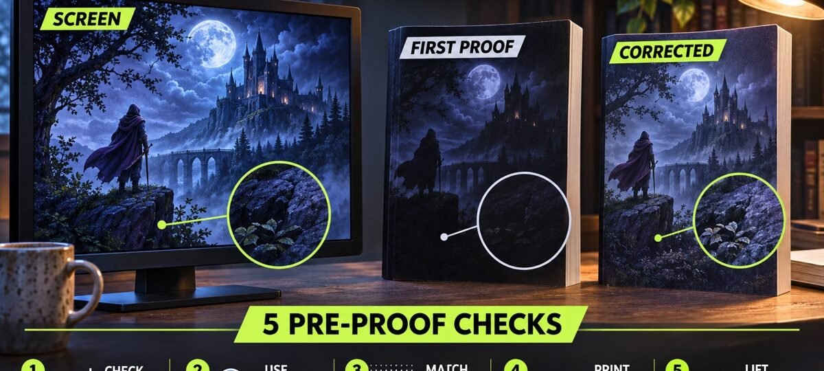
Printed covers can look darker because screens emit light while paper only reflects it, and print reproduction compresses some dark, saturated colours. Fix it before ordering: preview the print file, open essential shadow detail, check it at lower screen brightness, and always order a printed proof.
The author proof arrives, and the moody midnight cover you approved on screen is now a black rectangle with a title on it. The face is gone. The forest is gone. This is the most common print complaint in self-publishing, it fills author forums every month, and almost nobody explains the actual mechanics. We prepare print files for dark covers weekly, so here is what is happening and the checks that stop it before you pay for copies.
The dark covers shown below are live listings from our shelves (164 horror and 12 dark romance designs in stock as of this update). Every design sells once, then retires. Designer-Created covers start at $49.99 for the ebook tier; AI + Human covers are labelled and start at $24.99.
Why does print always look darker than the screen?
Your monitor is a lamp. Every pixel you look at is light shining directly into your eye, and most screens ship set bright enough to read in a sunlit room. Paper produces no light at all. A printed cover only reflects whatever room light falls on it, so the same image starts from a much lower ceiling before ink even enters the picture.
That gap alone would make any print look dimmer than its screen preview. Dark covers get hit twice, because the extra causes below all take their bite out of the shadow end of the image, which is exactly where a dark cover keeps its detail.
The 5 causes, in the order they bite
- Backlit screen vs reflective paper. The physics above. Unavoidable, and the reason every fix involves designing brighter than feels right on screen.
- Screen colour versus printable colour. Screens mix light; presses reproduce colour with inks or toner on paper. Some saturated screen colours cannot be matched exactly, and dark blues and purples are especially easy to compress. KDP advises against mixing colour spaces in one print file because it can create unexpected variation.
- Press, stock and production variation. Print-on-demand output varies with the machine, paper and production run. Closely spaced shadow tones can merge, even when they remain separate on a bright monitor.
- Finish changes contrast. KDP says glossy finish makes black covers look darker and artwork more striking, while matte has minimal sheen. Neither is automatically better; the finish changes how contrast feels under room light.
- Your screen is set too bright. Design work done at full laptop brightness produces files that only look right at full laptop brightness. This is the one cause you can remove entirely for free.
Which covers are most at risk?
Any cover that keeps its important detail in the darkest quarter of the image. That describes half the horror shelf and most of the dark romance shelf, which is why we colour-check these categories hardest before a print file leaves the studio.
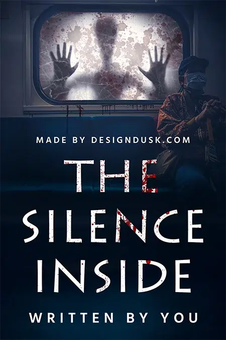
The Silence Inside
The Silence Inside (AI + Human, labelled, $49.99) is a textbook risk case. On screen, the navy seat backs, the black window frame and the shadowed floor all read as separate surfaces. In print, those tones sit close enough that an untested file could merge them and lose the seated figure. The paperback file therefore gets a separate shadow-detail check before it reaches the press.
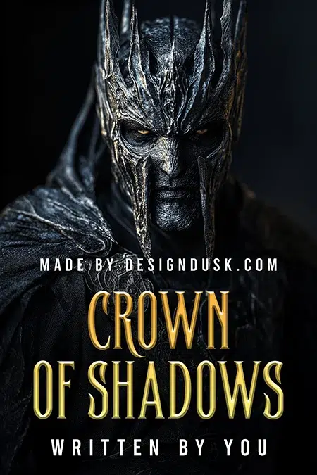
Crown of Shadows
Crown of Shadows (AI + Human, labelled, $24.99) lives even deeper in the shadows: the engraved armour texture is the whole design, and it sits entirely in the bottom of the tonal range against a pure black background. The gold title and the pale eyes carry the contrast. The armour detail needs a separate print check, which is exactly the adjustment the paperback tier includes.
How do I stop my cover printing too dark?
These are the pre-proof checks we run on every dark cover, in order.
- Preview the print file in your design tool. Photoshop, Affinity and InDesign can simulate print-oriented colour changes. Do not assume a generic GRACoL or SWOP profile is KDP’s profile: KDP does not publish a required soft-proof profile and removes embedded colour profiles before publication. Use the preview to find fragile shadows, then rely on a physical proof for the final decision.
- Drop your screen to half brightness and look again. Crude, free, and surprisingly close to how the proof will feel in your hands. If the cover dies at half brightness, it will die on paper.
- Open the shadows in a controlled test. Raise shadow detail only until essential faces, objects and textures separate clearly from black. Ten percent can be a useful first test, not a universal formula; the right adjustment depends on the image, paper and finish.
- Keep detail off the floor. Anything the reader must see (a face, a weapon, a title underlay) should sit clearly above the darkest tones in the image, not inside them.
- Order the printed proof, every time. A KDP proof costs the printing price plus shipping and answers the question no preview can. Approve nothing sight unseen, and check the proof in normal room light, not under a desk lamp.
If you want the template maths behind the wrap itself (trim, bleed, spine), our book cover size guide has the full numbers.
What if the proof already came out dark?
Do not panic and do not reprint blind. Go back to the source file, apply a controlled shadow adjustment, preview it, and upload the revised cover through your KDP Bookshelf. KDP documents the update workflow and re-reviews the book; it does not list a cover-file update fee. A second proof is cheap insurance. If your IngramSpark file bounced in processing rather than printing dark, our IngramSpark rejection decoder walks through each problem.
Every DesignDusk paperback tier includes this print pass: the wrap ships built on your printer’s template with shadows checked for press, not for screen. Dark covers are our home turf (browse the fantasy shelf and count the midnight palettes), and if your book needs something built from scratch, custom covers run $120 to $350 with print files included.
FAQ
Every DesignDusk paperback tier (from $59.99) includes a press-checked print wrap. 1,500+ designs in stock, each sold once. Start with the horror shelf or the dark romance shelf.
Screens emit light and paper only reflects it, so print has a lower brightness ceiling than a monitor. Colour conversion, paper, finish and production variation can then compress closely spaced shadow tones. Dark covers lose shadow detail first, which is why faces and backgrounds can disappear.
They look different rather than following one universal darker-or-lighter rule. KDP says glossy finish makes black covers look darker and artwork more striking, while matte has minimal sheen. Order the finish your genre needs, then judge its actual contrast from a physical proof.
There is no safe universal percentage. Start with a small shadow adjustment, keep anything the reader must see clearly separated from pure black, and compare a printed proof in normal room light. Adjust from the proof rather than repeatedly guessing from the monitor.
KDP processes the file for production, but it does not promise to retouch your artwork or rescue shadow detail. Colour profiles may be removed and files may be converted, yet those are production steps rather than creative corrections. Previewing and approving a physical proof remain your responsibility.