
Quick answer
YA book covers sell on six conventions: illustrated art over photography, oversized type that carries the design, saturated palettes that read at thumbnail size, clear age-band signals, fantasy crossover codes for romantasy-adjacent stories, and covers aimed at the actual buyer, who is as often an adult as a teenager.
Search this topic and page one is written for readers: favourite-covers-of-the-year lists, ranked and re-ranked. Useful if you want opinions, useless if you are an indie author choosing a cover on a deadline. This is the author-facing version: the six conventions the category runs on right now, each shown on a cover you can actually buy.
All covers below are in stock on our young adult shelf as of this update (47 designs), each sold once and then retired. Every pick here is designer-created at $49.99 for the ebook tier; paperback and hardback tiers add the full print wrap.
Convention 1: Illustration is the default
The biggest shift of the last decade: illustrated covers went from exception to expectation across YA contemporary and romance. Drawn characters let every reader project themselves into the story, where a photographed model is always somebody else’s face. Illustration also survives trends better and photographs of teenagers date fast.
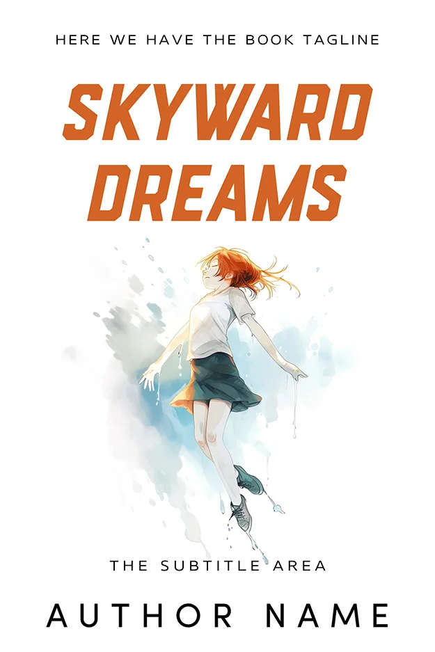
Skyward Dreams
Skyward Dreams shows the illustrated contemporary code: one drawn figure caught mid-leap, loose watercolour splashes standing in for a background, and everything floating on clean white. The energy is the subject. Sporty orange capitals keep it modern, and the white field makes the thumbnail unmissable in a results grid.
Paths Intertwined
Paths Intertwined is the romance flavour of the same convention: an anime-influenced couple on suitcases, faces turned toward each other, sunset doing the emotional lighting. The style promises warmth without spice, which is exactly the calibration YA romance needs, and the rounded type keeps the tone light.

Convention 2: Type carries half the cover
Current YA design gives typography equal billing with the art, and the boldest covers let it lead: a flat colour field, one strong image fragment, and a title big enough to read from across a bookshop. For contemporary stories without a fantasy landscape to paint, a type-led cover is the cheapest reliable route to looking current.
Dreaming in Rosé
Dreaming in Rosé commits completely: a single pink field, the top third of a head in headphones entering from the bottom edge, and a two-weight serif title doing everything else. The crop is the wit. It reads perfectly at thumbnail size, and the monochrome discipline signals confident contemporary fiction with a sense of humour.

Convention 3: Design for the thumbnail first
YA is discovered on phones: store results, social feeds, library apps. A cover that only works at full size does not work. The practical tests are simple. One focal point, a title readable at postage-stamp size, colour contrast that survives a dim screen, and no detail that matters below 100 pixels wide. Our book cover size guide covers the pixel specifics per platform.
Run the test on the two covers above: both reduce to a clear silhouette and a legible title. That is not luck; it is the first check we run on every young adult cover before it reaches the shelf.
Convention 4: Signal the age band on purpose
YA spans roughly ages twelve to eighteen, and the cover tells readers which end of that span a book sits at before the blurb gets a chance. Younger-skewing covers use brighter light, rounder type and more innocent framing; upper YA borrows adult styling with moodier light and more sophisticated typography. Missing the band by accident is one of the most expensive mistakes an indie can make, because the wrong readers pick it up and review accordingly.
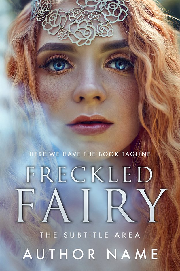
Freckled Fairy
Freckled Fairy reads younger: an open, unguarded face filling the frame, soft mist, a delicate circlet and a clean white serif. Everything about it is bright and sincere, which is precisely the signal a lower-YA or crossover middle-grade fantasy wants to send.
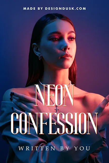
Neon Confession
Neon Confession reads upper YA into adult crossover: moody two-tone neon, guarded body language, and a thin fashion-magazine serif. Nothing here is childish, and that is the point. The same reader who found Freckled Fairy too young will pull this one off the shelf.
| Cue | Younger YA | Upper YA / crossover |
|---|---|---|
| Light | Bright, warm, open | Moody, neon, dusk |
| Faces | Open, direct, sincere | Guarded, cropped, shadowed |
| Type | Rounded, clean serifs | Thin serifs, editorial styling |
| Palette | Saturated and friendly | Restricted, sophisticated |
Convention 5: The fantasy crossover has its own codes
A large share of YA sales is fantasy, and the crossover borrows from both shelves: the object cover (crown, sword, flower on black) from adult fantasy, plus the saturated colour and romantic charge of YA. If your book leans romantasy, decide early which shelf leads, because the cover can only put one first. Our fantasy cover design guide covers the adult end in depth.
Twilight’s Regent
Twilight’s Regent is YA-led fantasy: a crowned heroine in golden light, the world soft and inviting, with a bold red didone serif adding the drama. The warmth keeps it in YA territory; an adult epic would cool the palette and pull the camera back.

The Bloodstone Crown Dark Fantasy Cover
The Bloodstone Crown is the crossover pushed dark: a crowned skull wreathed in roses, pure object-cover logic from the adult shelf, but the playful hand-drawn quality of the red serif keeps a YA and new adult audience in reach. This is the code for dark academia and enemies-to-lovers romantasy that wants older teens plus adult readers.

Browse both codes side by side on the fantasy shelf and the young adult shelf and the dividing line becomes obvious fast.
Convention 6: Design for the buyer as well as the reader
A large fraction of YA is bought and read by adults, and more again is bought by adults for teens. The practical consequence: a YA cover has to pass two filters, exciting to the reader and credible to the buyer. Covers that skew too juvenile lose the adult crossover audience; covers that skew too adult worry the gift buyer. The age-band table above is really a positioning dial, and where you set it should be a sales decision made before design starts, the same way you would position the blurb.
What a YA cover costs
Premade is the fast lane: our young adult premades are $49.99 for the ebook cover, sold once and retired, with print wraps available on every design. Custom, for a specific scene, a series template or a character you describe, runs $120 ebook to $350 hardback through custom design. The full market pricing picture, including what other studios charge, is in book cover design cost.
FAQ
All 47 young adult covers are in stock, sold once each, at $49.99 for the ebook tier. Need a series template or a specific character? Custom design runs $120 to $350.
Illustrated or stylised art rather than straight photography, oversized expressive typography, saturated colour, and a young protagonist framed with energy or longing rather than menace. YA covers also signal their age band deliberately: brighter and rounder for younger readers, moodier and more editorial for upper YA and adult crossover.
Illustrated faces work well because readers can still project themselves into a drawn character. Photographic faces are riskier: they fix the character, date quickly, and can accidentally shift the age band. If you use photography, current practice favours cropping, shadow or turned bodies over a full, sharply lit portrait.
Premade covers run $24.99 to $49.99 for an ebook licence at our shop, with print tiers to $149.99, and each design is sold exactly once. Custom YA covers run $120 for ebook, $250 with paperback and $350 with hardback. Marketplace and agency prices elsewhere range from under $100 to well over $1,000.
YA covers run brighter, more illustrated and more type-forward, with protagonists shown young and the emotional promise front and centre. Adult covers in the same genres go quieter or darker: object covers in fantasy, restrained typography in literary fiction, colder palettes in crime. Crossover titles borrow adult styling while keeping YA warmth.